Project Background
sayso is a new product offered by OnSIP and is a free chatbot like widget that is embedded on a business website to allow the support and sales staff of that business to receive video or audio calls from site visitors.
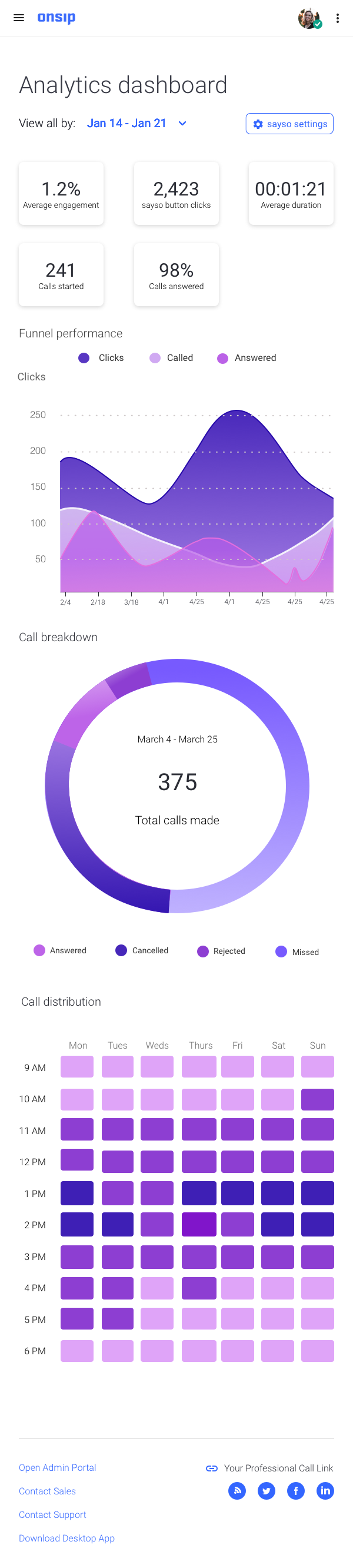
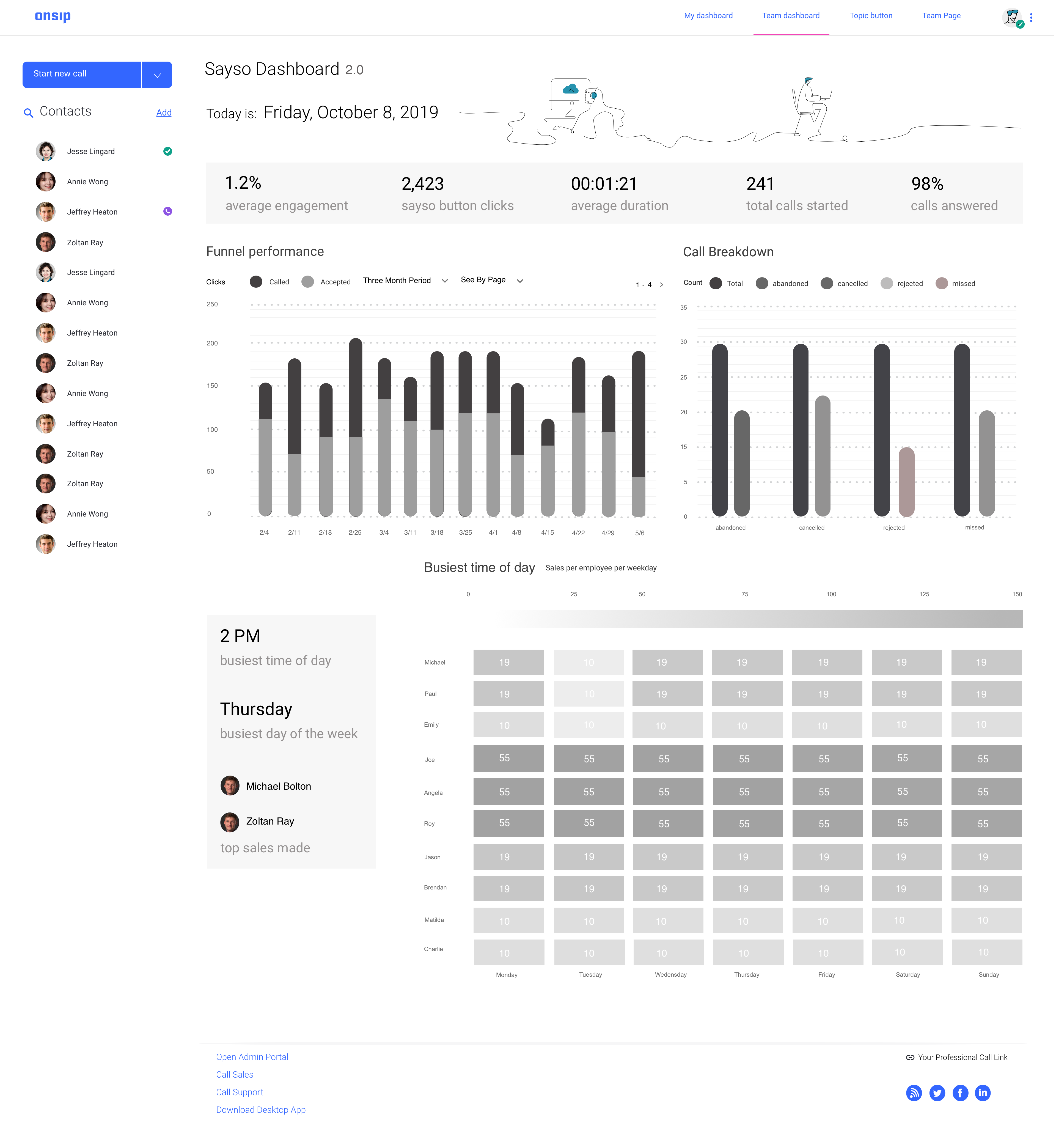
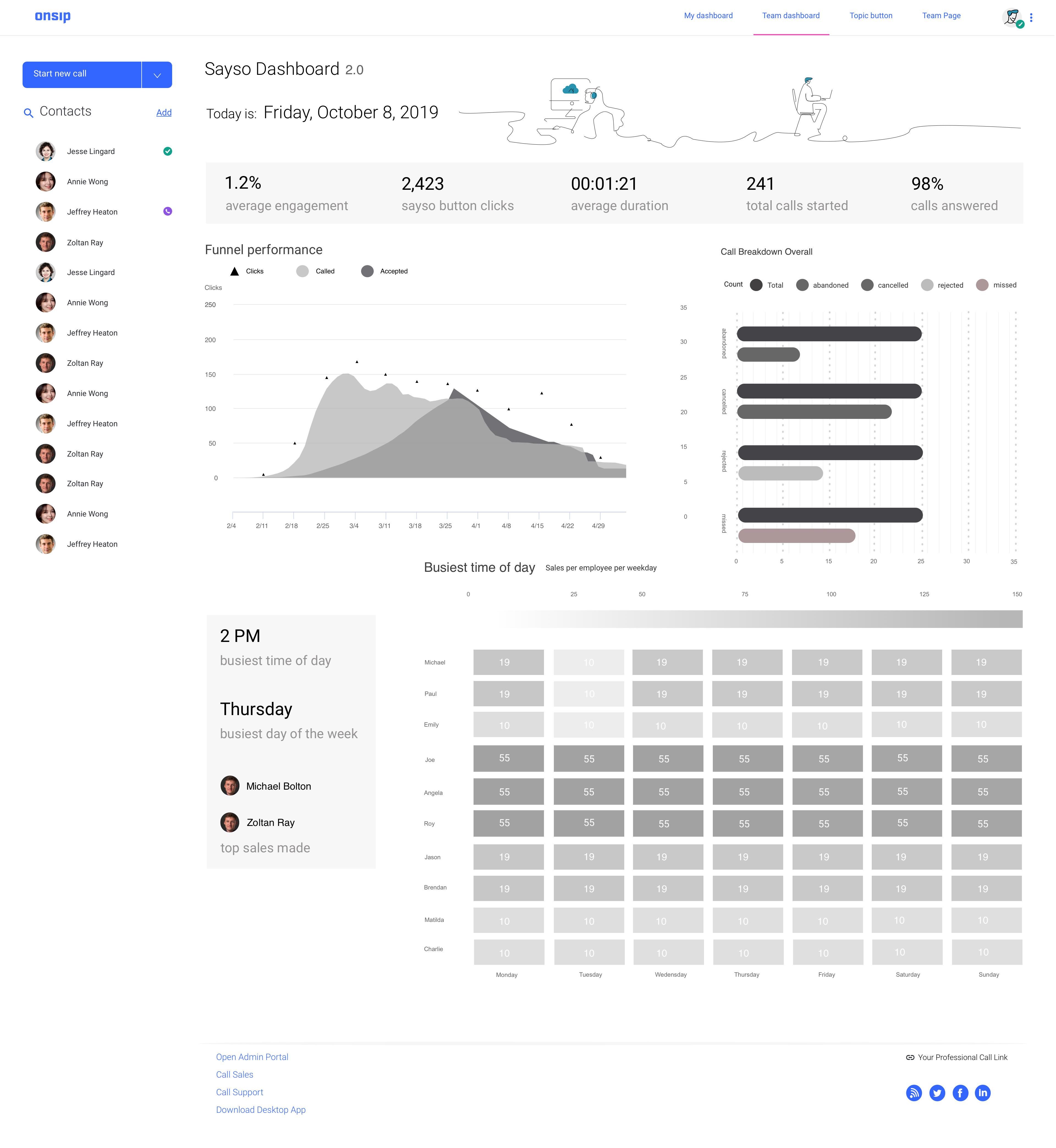
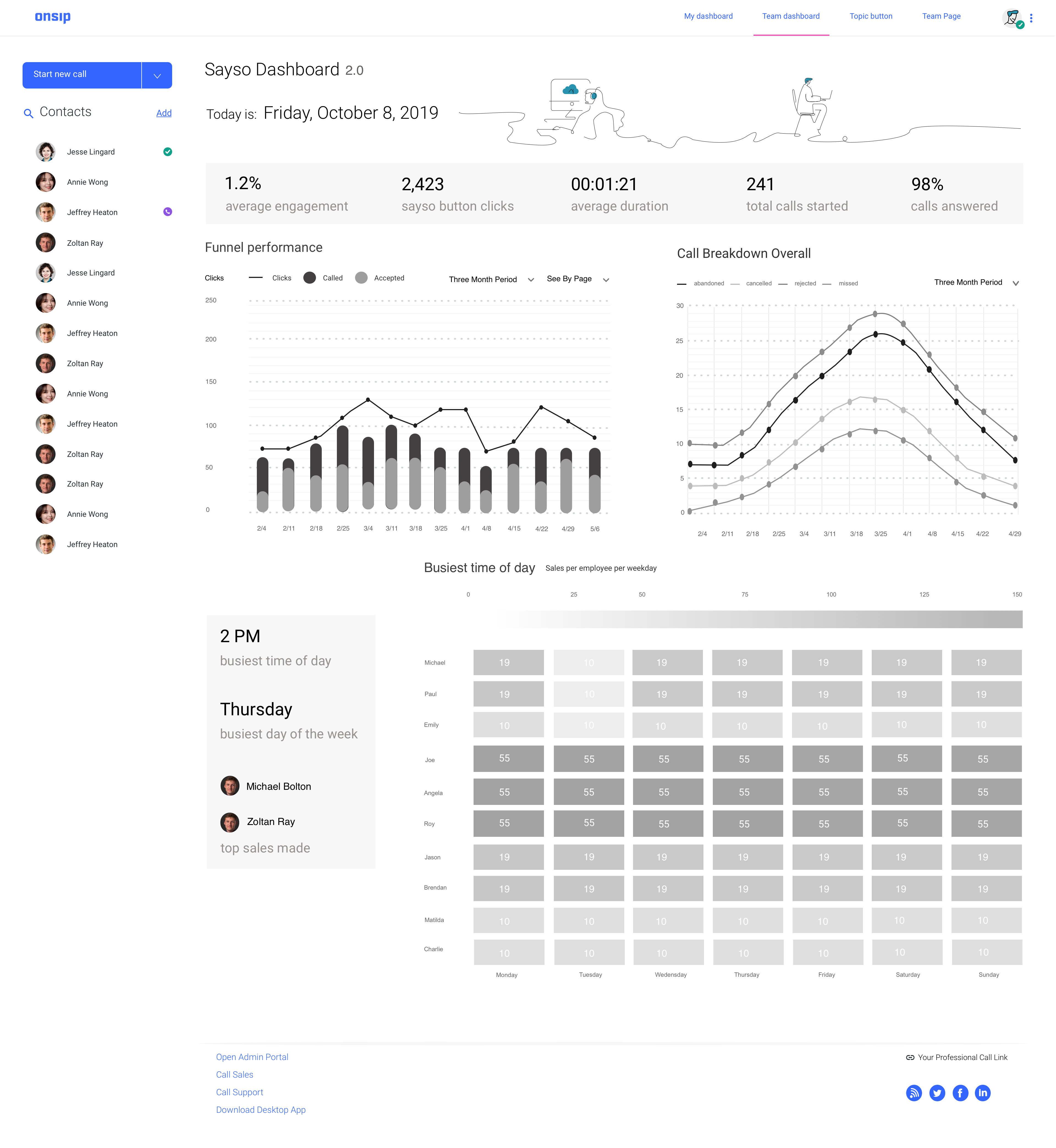
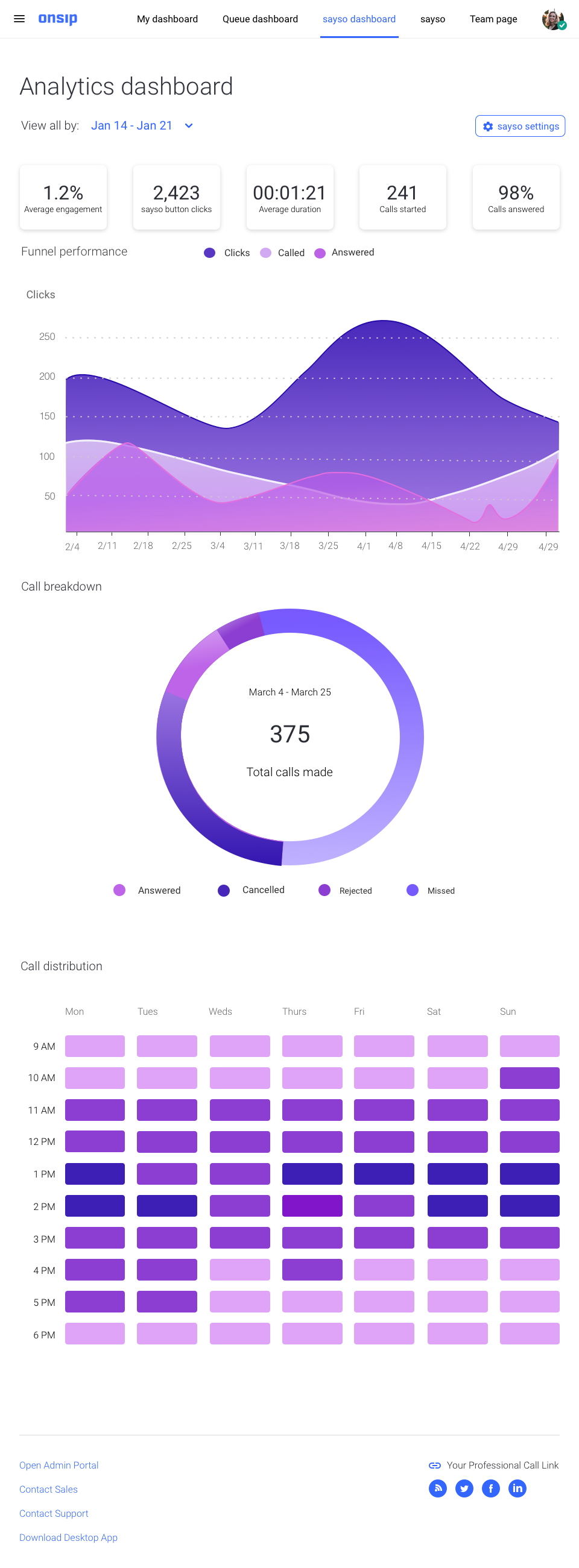
This sayso analytics dashboard would help sales and support team managers view how their sayso call agents were performing, call volume for a certain time period and see how many calls by site visitors were missed, canceled or rejected.
This was the first time data visualization had been done at OnSIP and a first that would adhere to our brand imagery as well. The page itself would live underneath a tab within OnSIP's internet phone calling web application alongside other tabs such as the “home page” which houses a potential user’s call history and a tab labeled the “team page”.
Timeline
July 2019- September 2019
Company:
OnSIP
Product:
sayso Analytics
Role & Team
Me (Product Designer)
Freelance Creative Director
Front-end Engineering
Data Analyst
How this Dashboard Relates to sayso
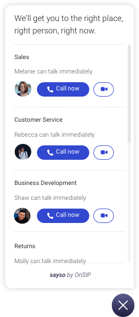
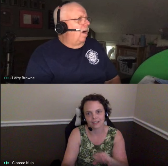
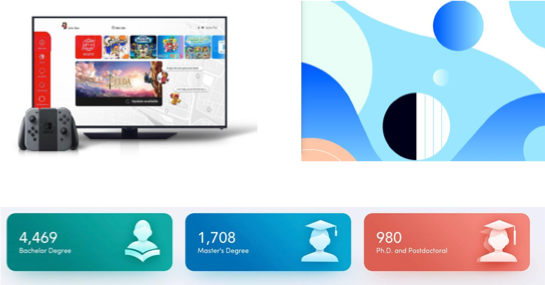
The widget below is sayso.
A company or business can install this widget on their website and the sales and support managers of that business can assign agents to take voice or video calls on topics such as "sales", "support" or otherwise right through their browser, utilizing WebRTC technology, with site visitors in real time. This has the advantage of connecting a live support agent with a customer right away as opposed to chatbots which are sometimes misleading about the agent's availability.
In our early user research for sayso, we learned from sales and support veterans at leading B2B and B2C companies that for sayso to be a competitive product it needed an analytics dashboard so people could actual data on how their agents were performing at a quick glance.
Sales and support agents at OnSIP also needed this analytics dashboard because OnSIP was using the sayso widget on their own business websites and could not see analytics on how their agents were performing. This project would help sell sayso as a more functional tool for medium to large size companies and solve our own issues on not being able to see statistics on how our agents were performing.
Quote from a user interview conducted about the needs of sayso.
Initial Requirements & Research
Before starting any design work, I got on a call with our own support agents and spoke with them about what such a dashboard needed as they would be the ones actually using it and had a wealth of feedback from customers who had also requested it.
The product owner and I then sat down and prioritized what we would build in this dashboard and a rough timeline of the tasks so we could break the work down in sprints and have engineering ready for the handoff process. The creative director/senior product designer provided direction for the visual explorations I did throughout the project and helped me make sense of the massive raw data I was dumped with.
We determined that:
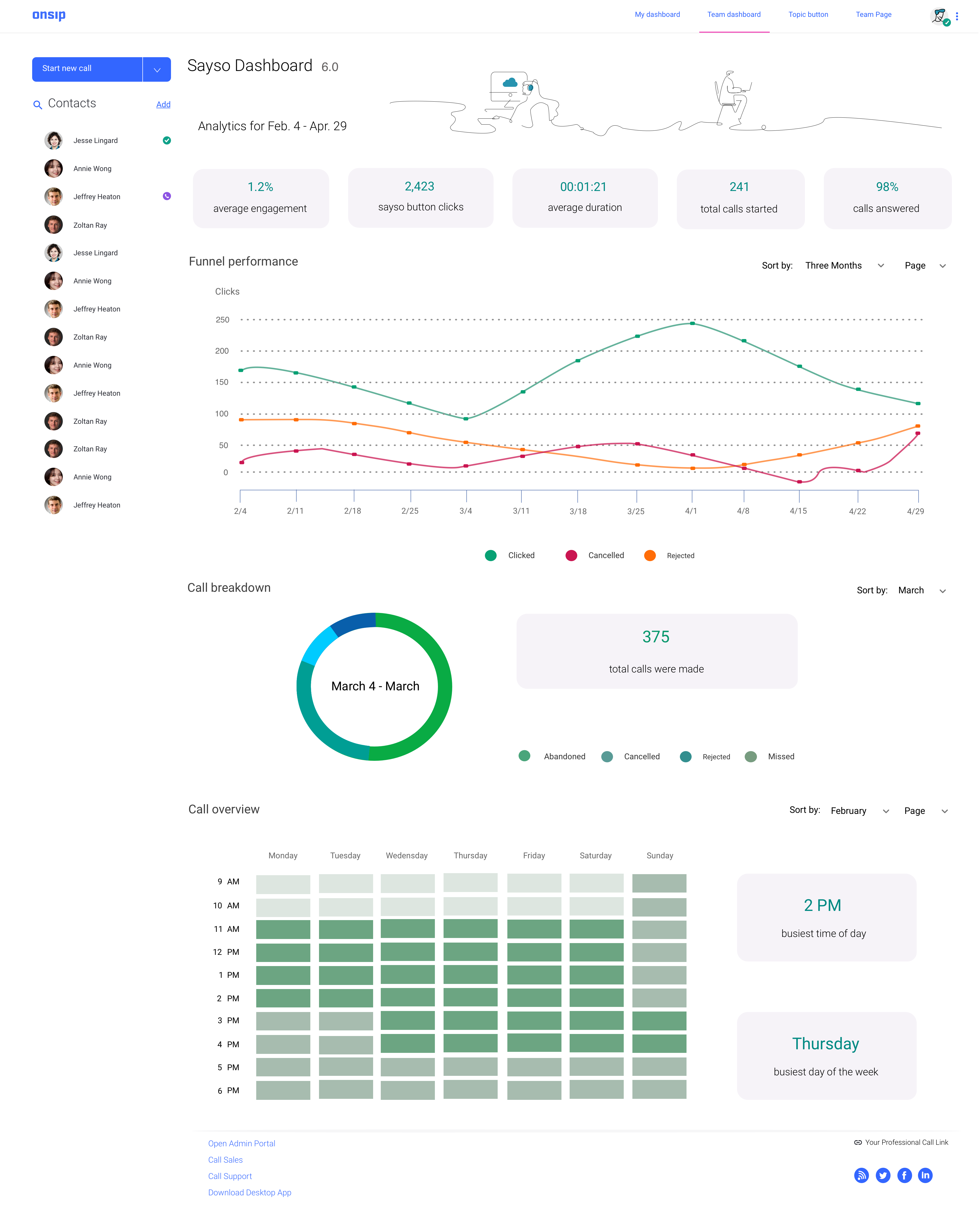
This dashboard page would show in a visually attractive but accurate form the following charts:
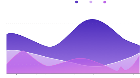
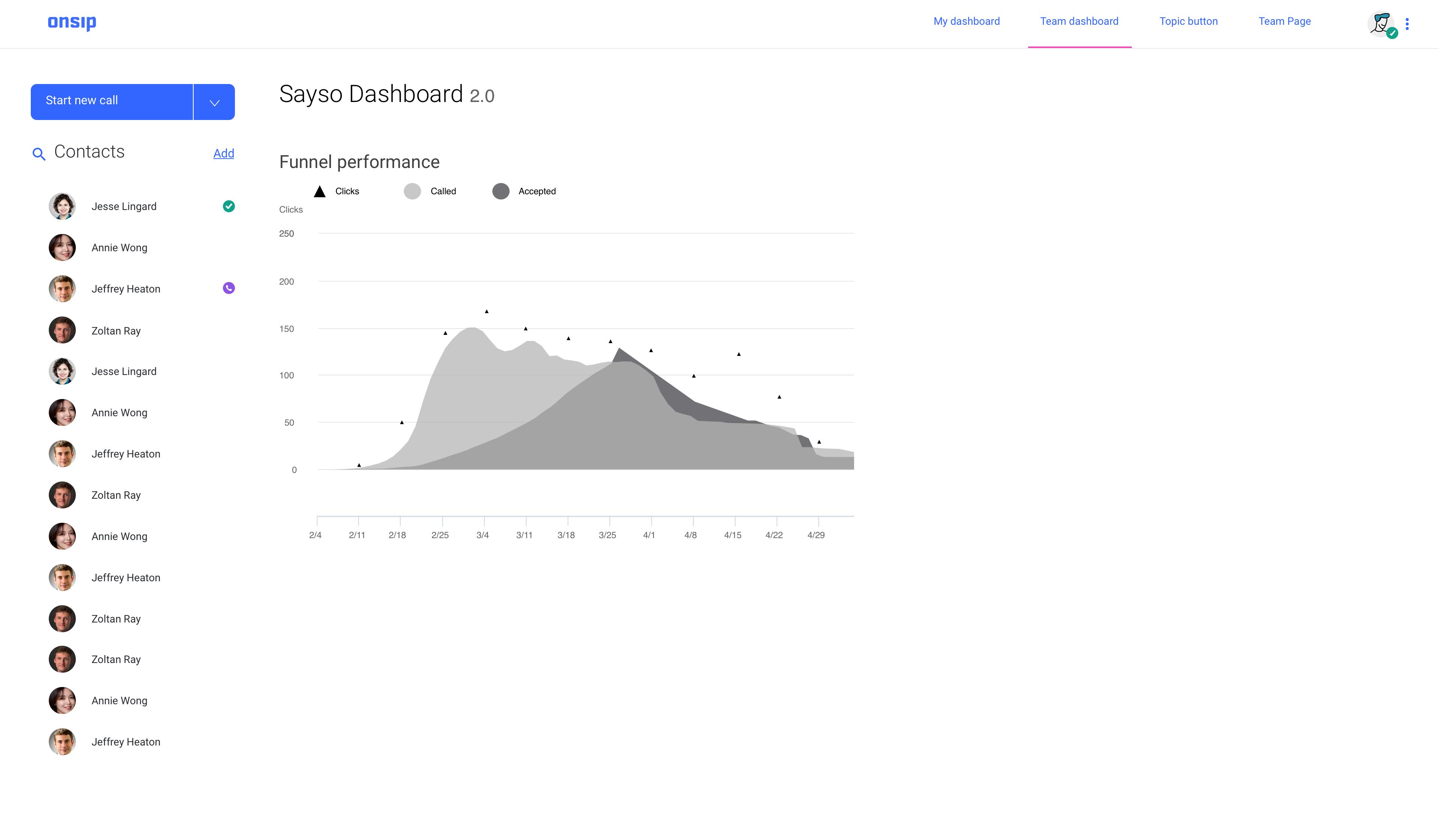
- Funnel performance
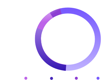
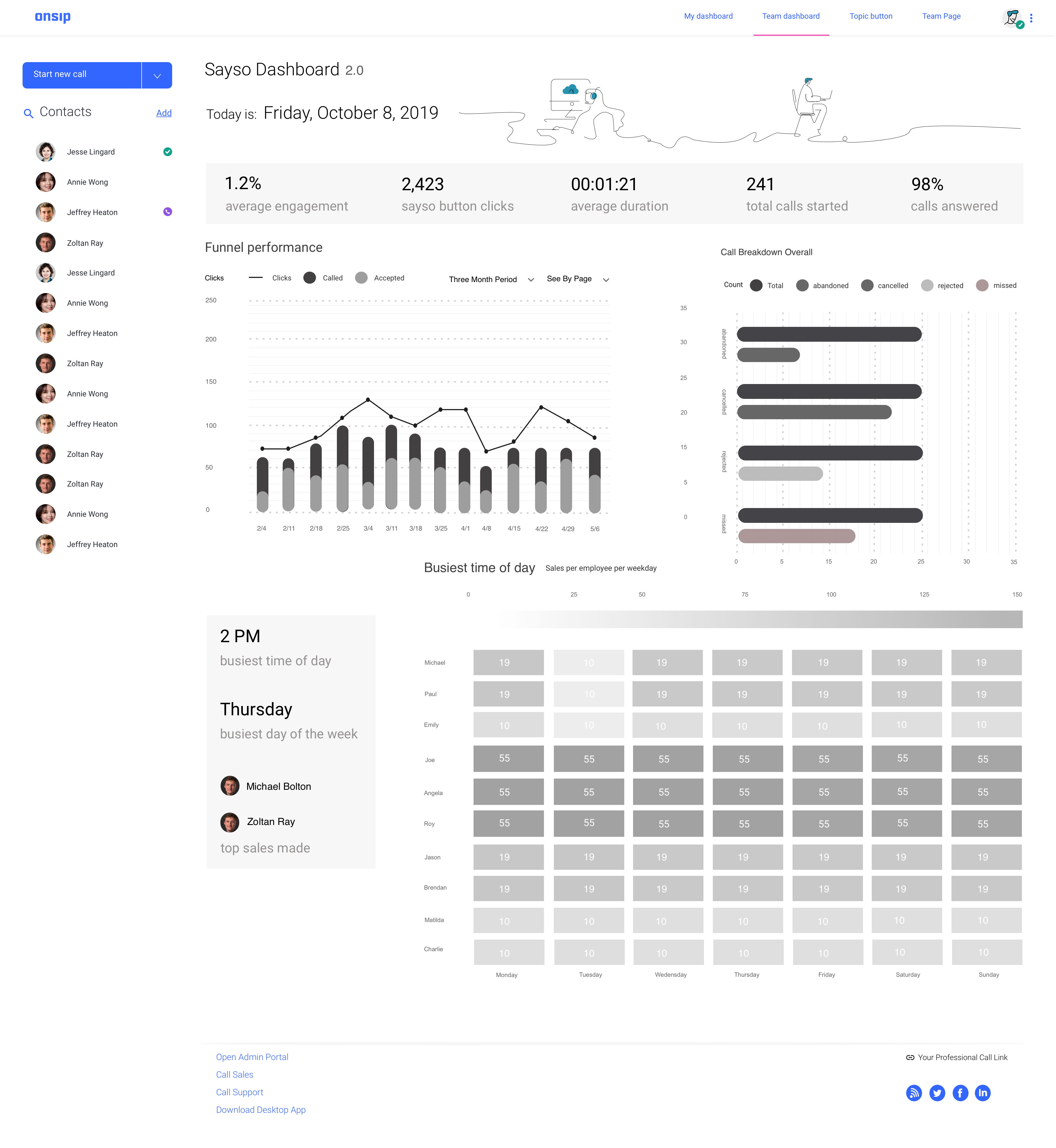
- Call breakdown by categories such as answered, canceled, rejected and missed
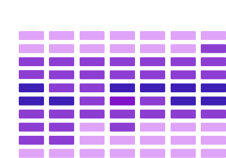
- A heat map with individual cells that would display the frequency of calls by time and day of the week.
Funnel Performance
Call Breakdown
Heatmap
The Constraints
The key difficulty with this project was in picking the right charts for the raw excel data that I was given and ensuring that I was designing while understanding the constraints.
The engineering team was utilizing a javascript framework called Highcharts to build out the charts and so I had to frequently reference the documentation to keep in mind what was possible and what was not.
The Process for v.1 of The Dashboard
The first thing I did was to spend a lot of time shifting through the excel file to see how the numbers would be best represented in the form of a chart. I ended up with those three chart categories above.
I also spent a long while looking up the types of charts and data representations that there were out there on the site and conducted a competitive audit to see how competitors handled their data visually.
I created a mood board to nail down how I wanted the page to look and feel and collected product images that I saw as an inspiration in terms of brand feel and function.
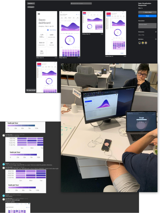
Funnel Performance, Heat Map and Call Breakdown variations in Gray-scale
Trying Different Types of Charts in Diffferent Styles in Gray-scale for all the charts
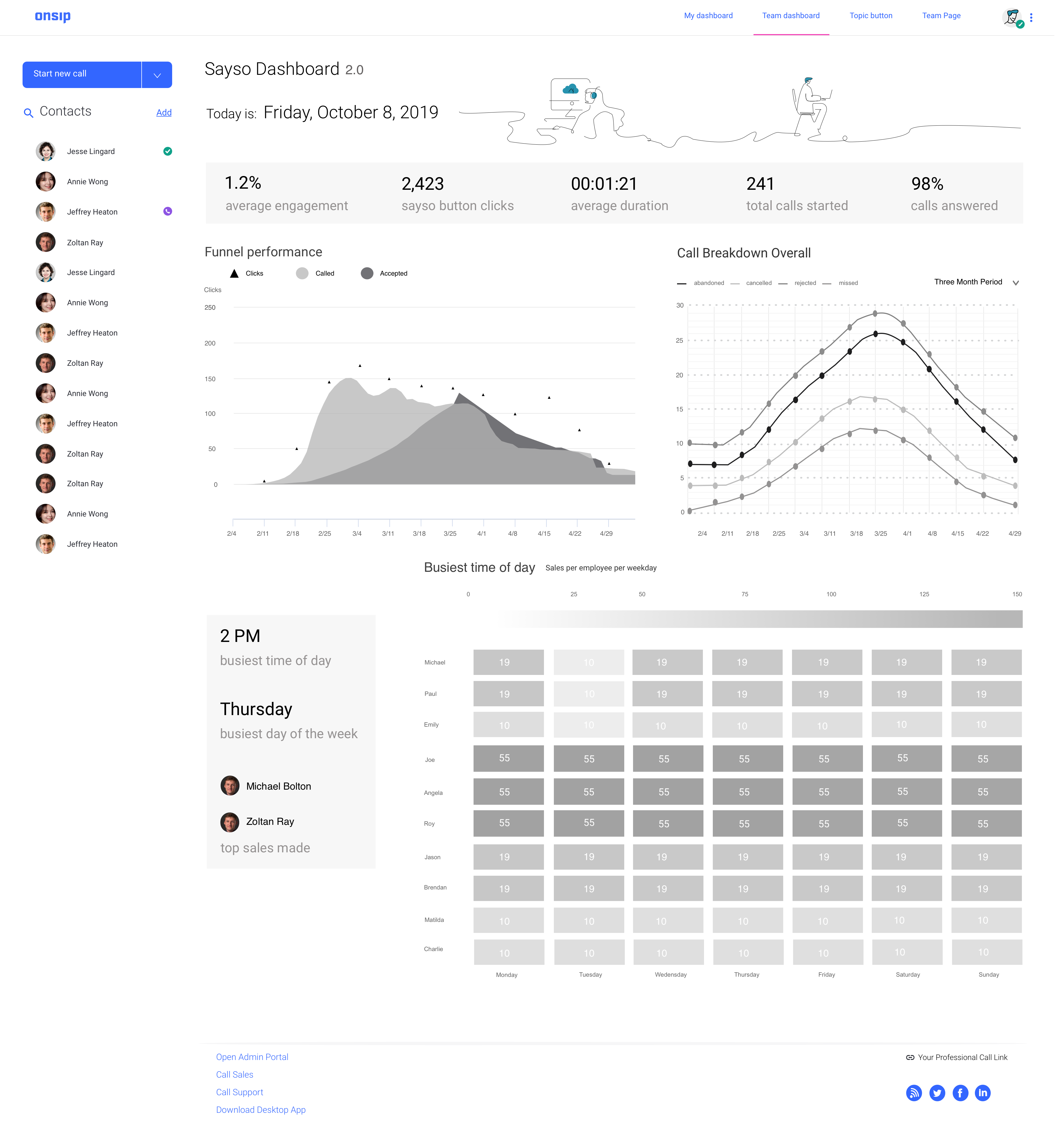
Funnel Performance:
I decided to narrow in on line or area charts as they show a clear sense of trend over time which is exactly what we needed. I saw that high-charts offered the ability to view more detailed info with tool tips so that gave me some more freedom to work with visually as we would not have to be very literal.
Funnel Performance in grayvscale
Call Breakdown:
After looking at the variations, I realized that I was looking at percentages of a whole so it would be better to go with a donut chart.
Heat-map:
It was more straightforward to just use a variation of a heat-map here than attempt to reinvent the wheel.
After narrowing down the types of charts that I was going to use, I attempted to narrow down the layout and order of the charts on the page.
The Process v.2
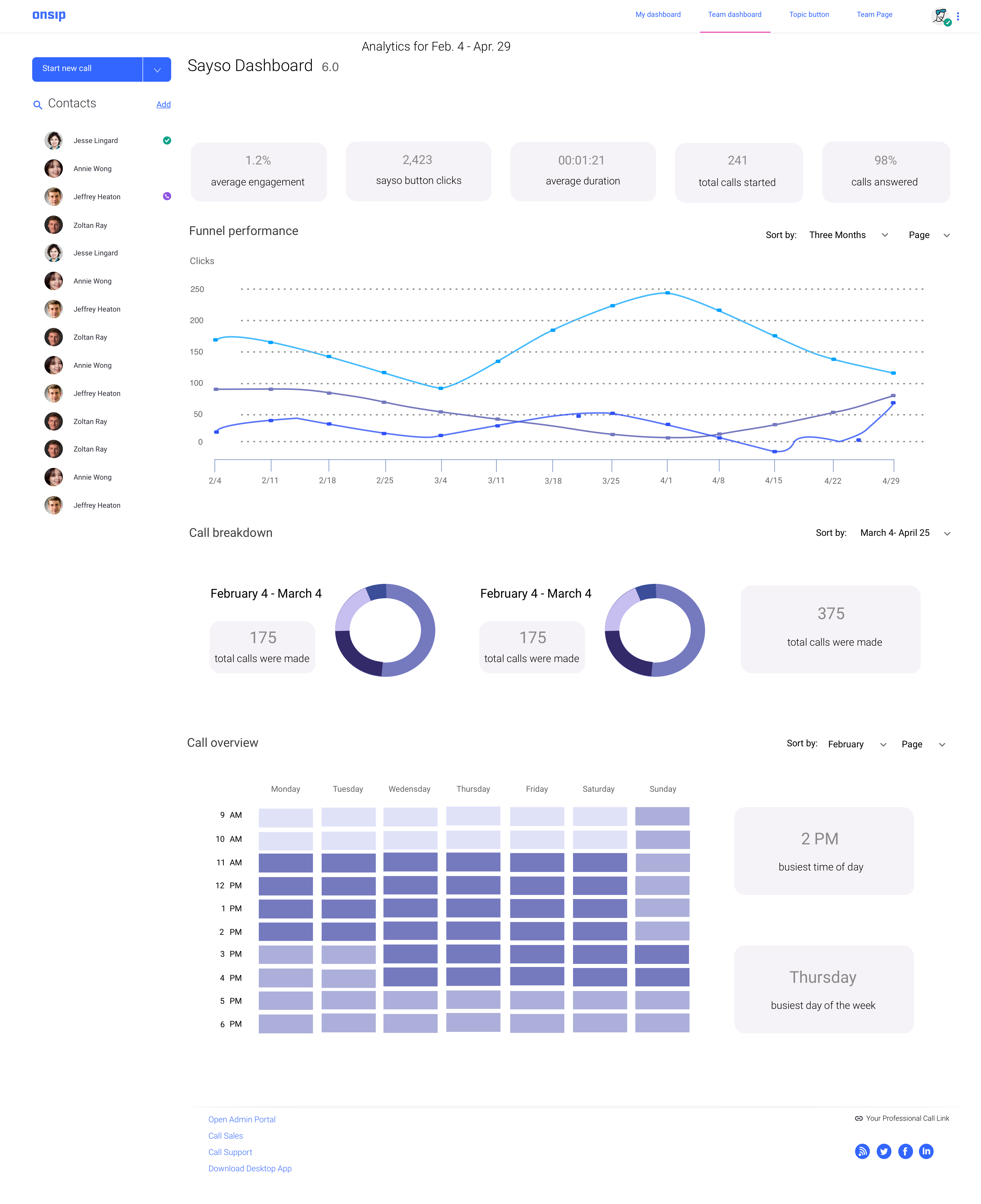
Changes that came about after this iteration:
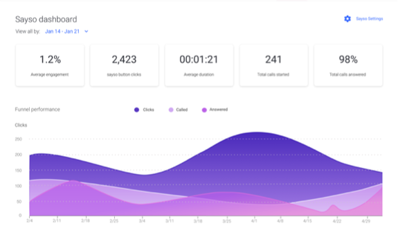
I decided to get rid of the three donut charts in favor of one large donut chart that would be easier to read but still retain all the information needed. Internal testing showed that the single, large donut chart was far easier and lessened cognitive overload.
I also added gradients to the lines as the single, dotted lines proved hard to follow. The waves of color overlapping over each other was a better visualization of data at a first glance according to feedback.
Illustrations on the top of the page were also taken out for better page loading times, and the date and time of the day were taken out for later versions.
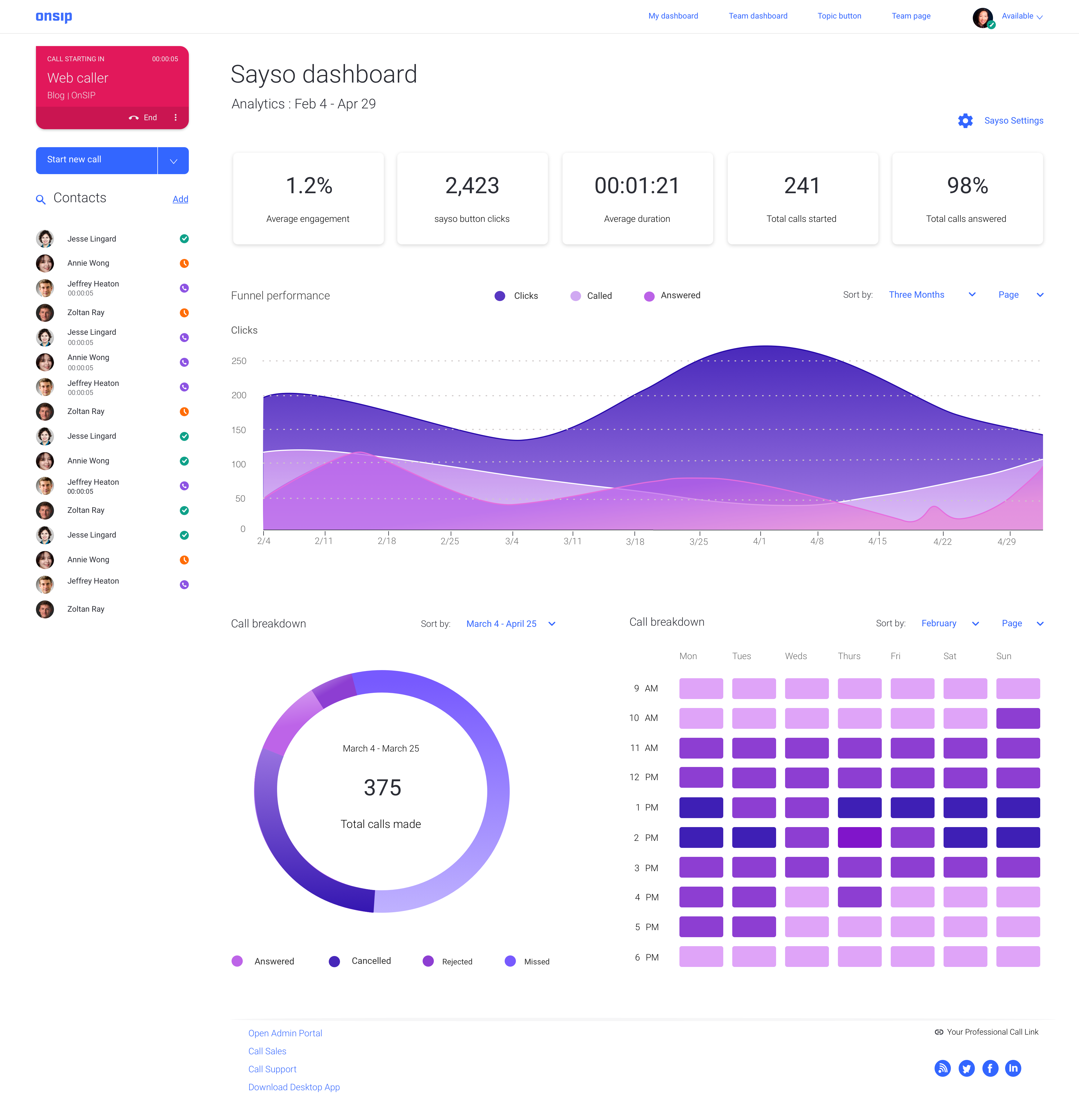
I struggled in this iteration with finally narrowing down the right color schemes for the types of charts that I had chosen. I tried different variations of green as our brand purple and the other colors did not seem to mesh well visually. The problem with the green was that I ran into issues with the contrast ratios of text versus the background color.
I finally went with the purple variation after getting the go ahead from the creative director.
I had wanted to add text over the heat maps in order to illustrate the data at a more granular level.
However, white text over the light green background would make it so that people would be unable to read the all important numbers.

While the purple colors worked, it was hard to differentiate between which layer was which. I experimented with different variations of the purple against a pink wave, adjusting the opacity of the waves, and putting a border radius on the top of each line. In the end, I went with a lighter pink against the purples to clearly show the category distinctions.
Development Handoff & Quality Assurance
After a meeting with the front-end lead, the director of software engineering, data analyst, a senior back-end engineer in charge of the API web calls, the product owner and the front-end developer who would be working on the project, the hand off process formally began.
We began estimates of how long the project would take in terms of sprints and made adjustments accordingly.
Some last minute design decisions came up as the product owner requested to add a link for administrators, the people would be using the page, so that they could quickly jump to their sayso settings page in case they wanted to navigate there quickly after viewing metrics. This was added to the top-right of the page. I also fielded questions on design and made trade-offs as necessary during this meeting.
Handing off designs through Zeplin
Changes after implementation conversations with engineering:
I went back and forth with engineering on whether to add a separate legend for the heat-map. We decided to omit it due to time constraints.
- I set a minimum and maximum color range for the gradients on the heat map.
- I reduced the gutters between the heat map cells to 4px from 8px
The primary challenge I faced during implementation:
I had to refer back to the high charts documentation which was highly technical. I understood a bit about how arrays in code related to providing “stops” for a minimum and maximum color range for the gradients on the heat map. I advised the developer to add a “stop” so that a spectrum band of color would not go overboard on colors as we would have a defined range that accurately matched what I had originally put on Zeplin.
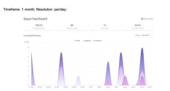
We loaded real data to test how it would look and act visually and learned some things:
. It turns out that the waves dipped in certain places and were not an even distribution. This was to be expected because the amount of actual data we could load was sparse in a test account and with high volumes of actual phone calls it would look better visually.
- We decided to adjust how data was displayed by reducing the risk of displaying partial data. This was achieved by displaying the last seven days.
- The small gaps on weekends was also covered by providing a rolling view for the monthly view
- Change tooltip to display ranges from every seven days e.g. 8/20 - 8/27
Changes after User Testing
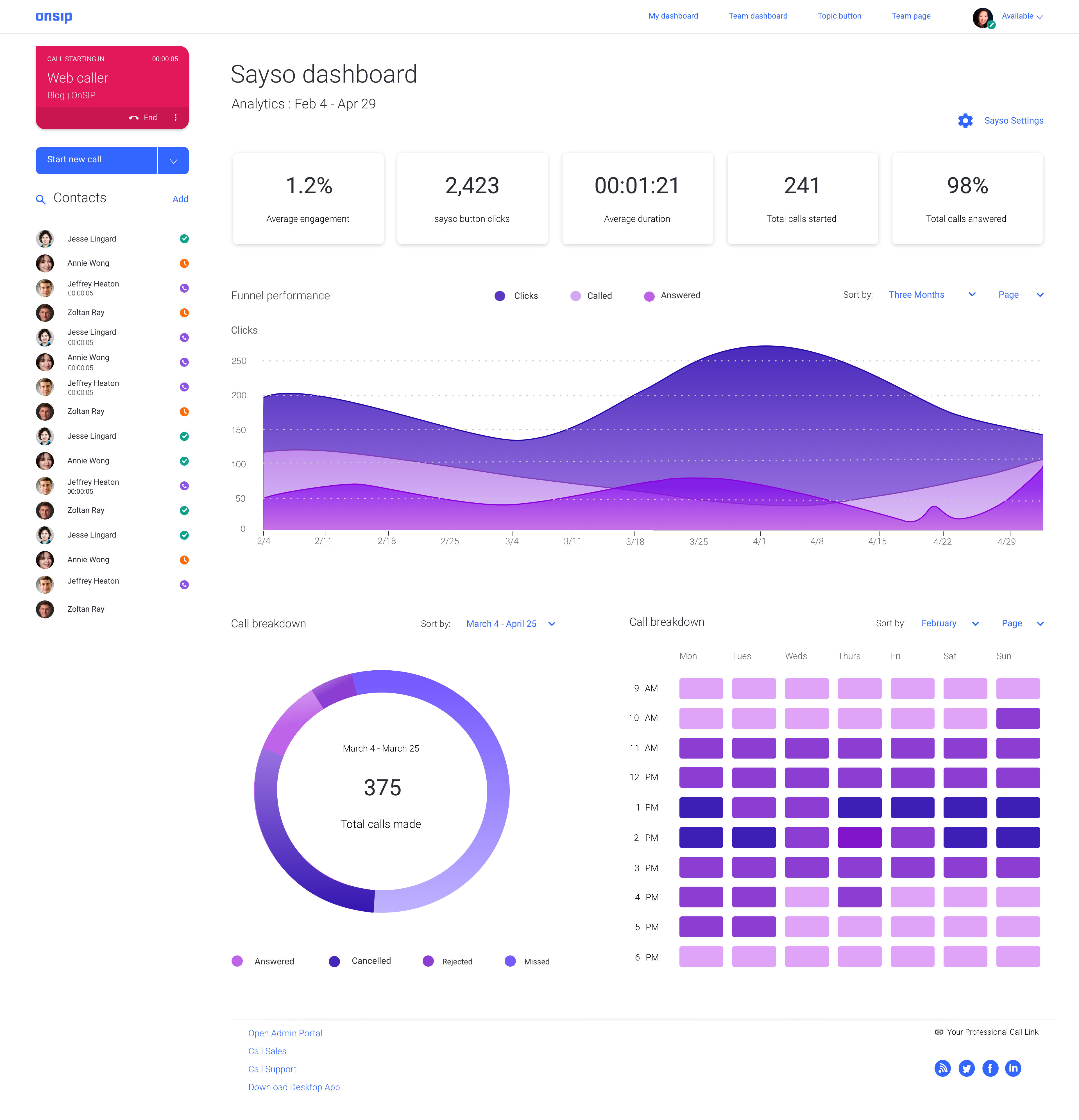
We released the first version in fall 2019 and gathered feedback on the analytics dashboard. In 2020, after numerous customer feedback saying that having filters on each chart was confusing we decided to change things.
We decided to add a global time period range as a dropdown to the top of the page and get rid of all the individual dropdowns that controlled time ranges as people found it easier to use by doing so. (The dropdown will still contain the same categories of date ranges: Last 7 days, Last 28 Days, Last 91 Days. Except the date ranges themselves will be within the dropdown.)
Early version of architecturing sayso settings and topic customization
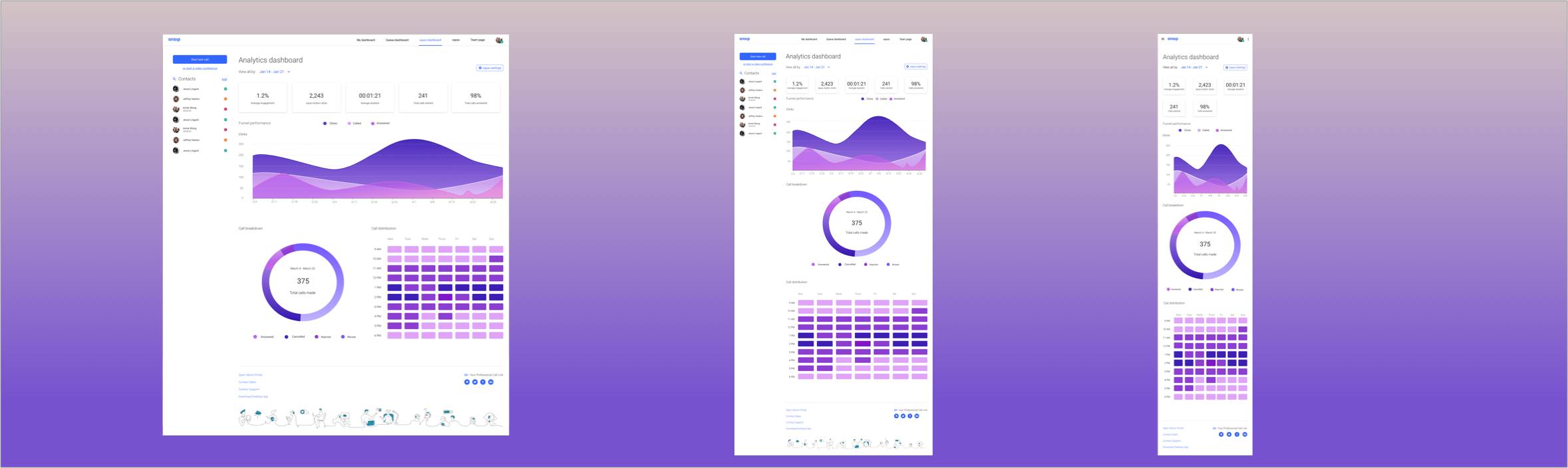
Final Screens
1920 px
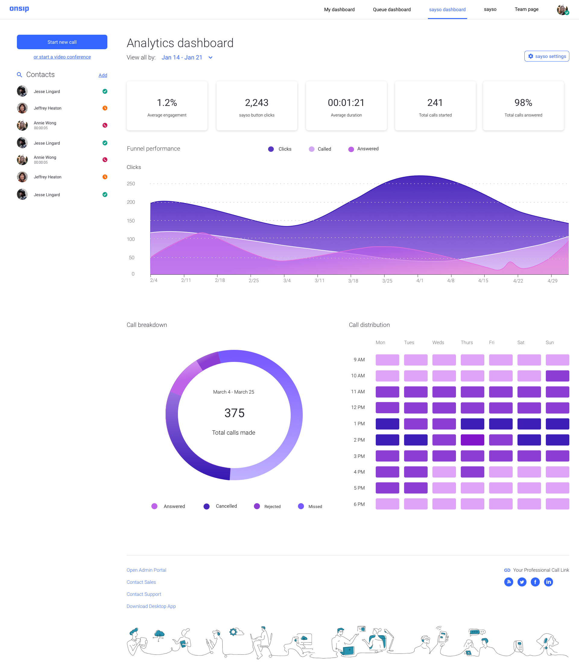
900 px
600 px