Project Background
OnSIP is a UCaaS (Cloud Communications) company that provides real-time communication services to over a 100,000 businesses.
OnSIP utilizes WebRTC to allow customers and companies to make and recieve internet voice and video calls on polycom phones, a mobile app and a web application that all work together.
I was tasked with redesigning all the pages to be more intuitive, then documenting all the user interface elements into OnSIP's first ever design system.
I coordinated solo with the front-end lead and his entire team to lead the implemention of the system at scale.
Timeline
January 2019 - October 2020
Company:
OnSIP
Product:
OnSIP Web Application
Role & Team
Me (Product Designer)
Creative Director (James Lockwood)
Front-end Lead (Jim Greenber)
Marketing (Stephanie Fornino & Maragaret Joy)
The Problem
When I first joined OnSIP it had a visually inconsistent app. (Images below)
Design at OnSIP had been done by contract designers and then by solo designers that left after a couple years. The first task I was asked to undertake was to change everything to Angular Material components as fast as possible and not to stray from that.
While I found Angulat Material to be a great guideline I never saw it as a hard playbook. Before I undertook the design, I had a meeting on what we could design custom and what we would leverage Angular Material for so that engineering had an easier time.
I argued for custom designs on anything that was related to making a call (end call button, dial a call etc.) as it was important for usability. I conceded to the rapid redesign but asked that a design process be followed for each page.
The strategy we underwent was to:
- First work on redesigns of all the screens of a legacy web application with a senior product designer in order to meet customer demands
- Then set out to incrementally implement a UI kit together that was paired with Sketch and Abstract for version control.
Redesign
When I embarked on the web application redesign:
- I gathered requirements on each and every page and got a run down on the functionality.
- Then I spoke with our onboarding engineers, support and sales teams to get an overview of how each of them interacted with the page, what part of each page they found the most important then did a "happy path" user flow of each page.
- Finally, we incrementally iterated on the redesigns after pushing to production. .
The following are some of the pages I redesigned:
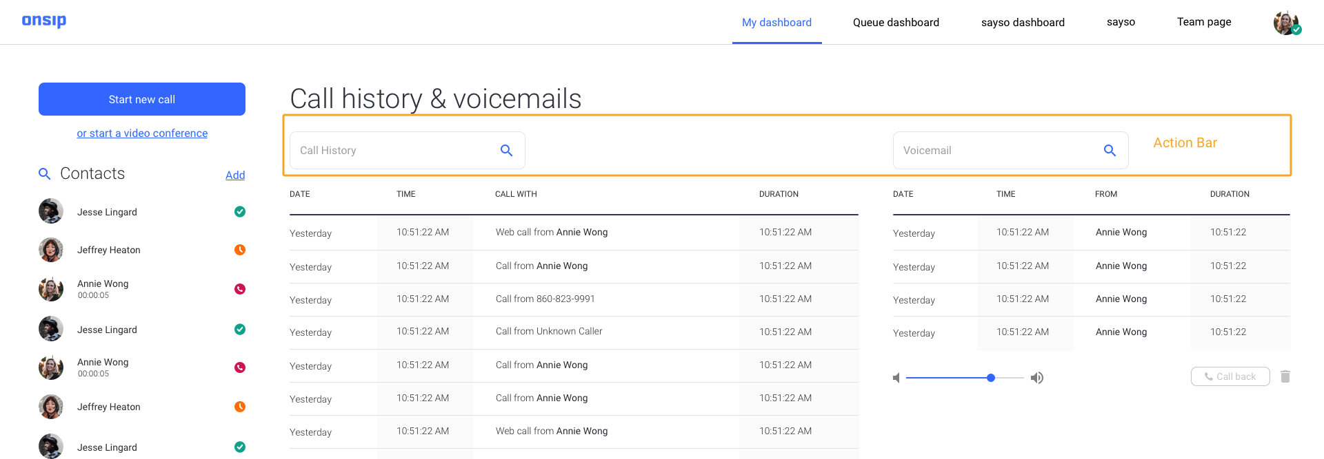
The old OnSIP Home Page
This is the first page of the web-application that I tackled in the redesign. The images on the right shows the old home page.
Just like Skype, Discord or other web-calling solutions when a user logs in, the home page with a list of recent calls, voicemail history etc. is the first type of page that they should see.

A New Home Page
The previous designs had the users call history and voicemail history hidden underneath a dropdown and the vociemail and call history wasn't immediately visibile.
As a result, after conducting a card sort with internal testing, I relegated the cards labeled: Try Our Desktop App”, “Connect With Us”, “For Admins” and “Need Help” to the page footer in order to create space to place the call history and voicemail history in a more visible location.
The next thing that I worked on was the responsiveness of the page and interaction of what exactly happens when a row is expanded. This expanded row interaction is a design that I reused as a table in the other pages of the web application.
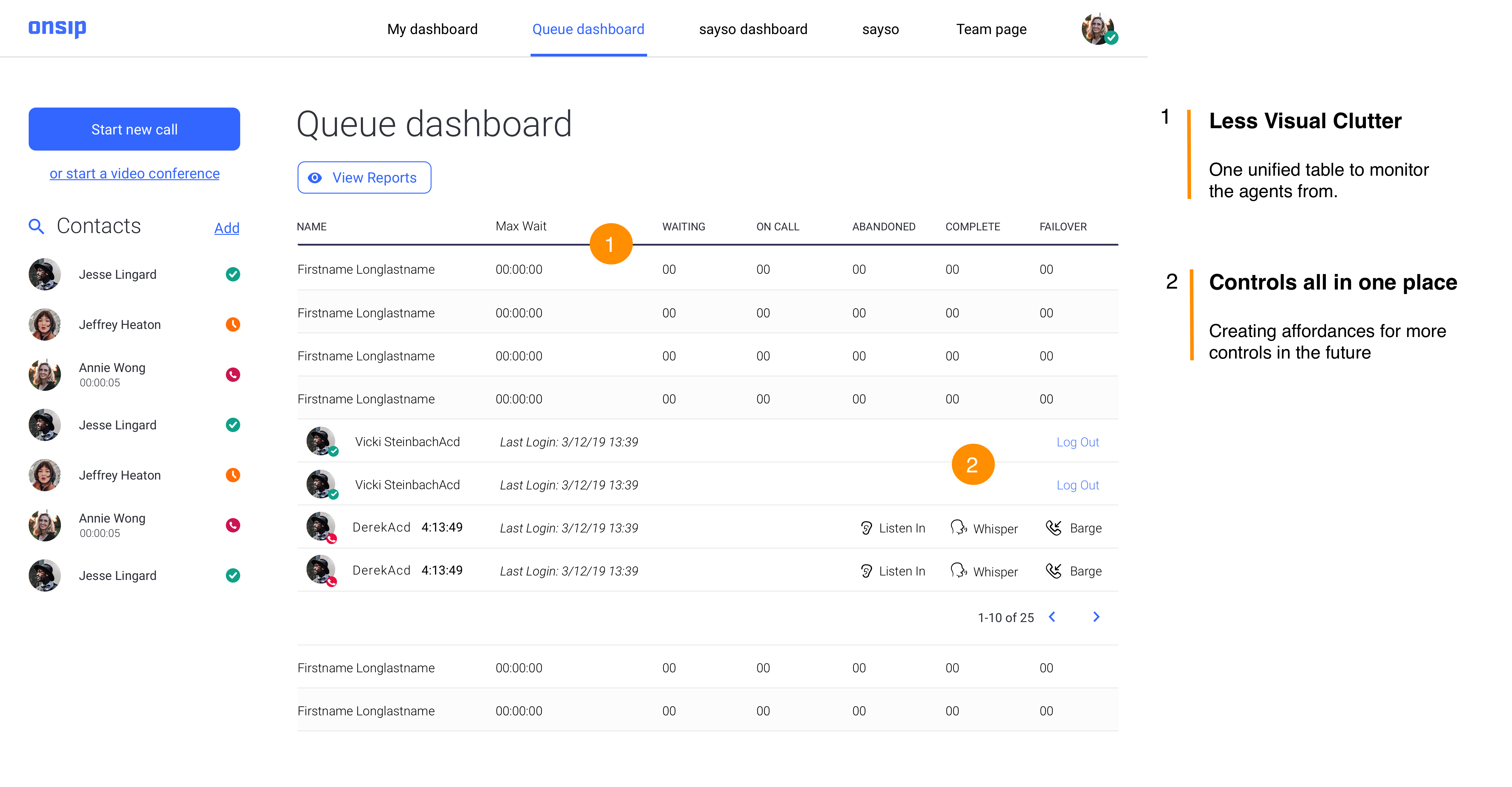
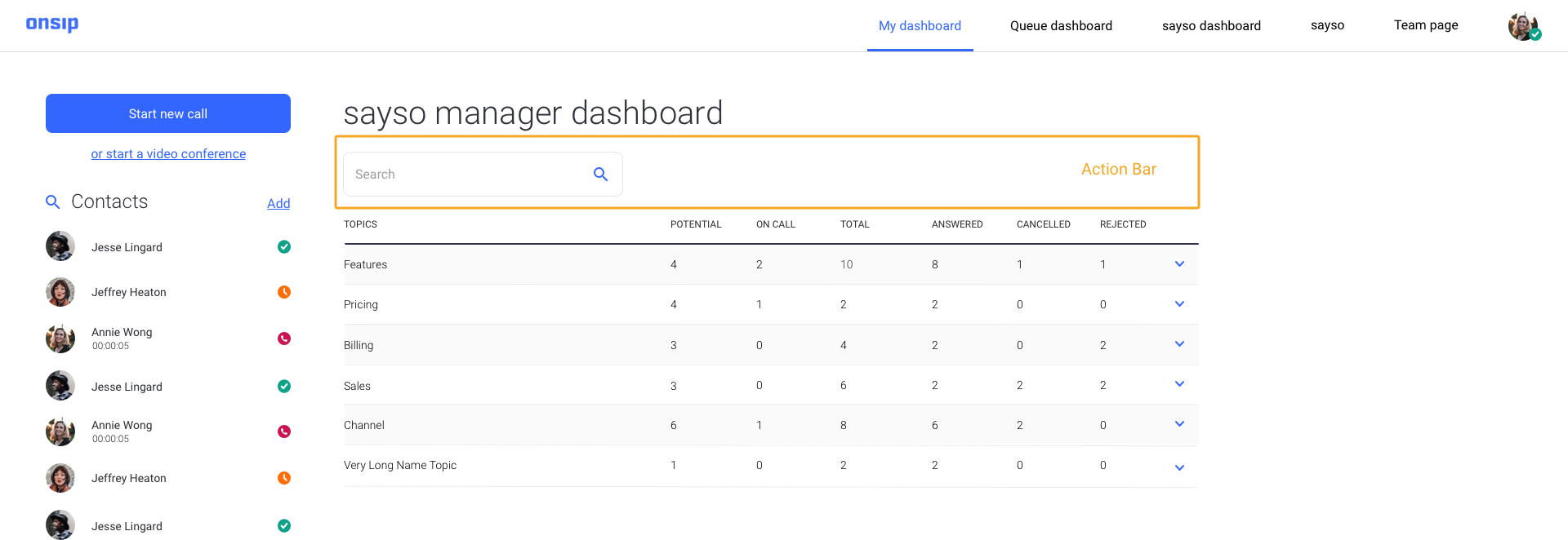
Old Queue Dashboard
The Queue Dashboard is primarily used as a sales or support team management tool. The image on the right shows how the old queue dashboard looked like.
A queue "administrator" or manager is able to see a roster of sales or support agents, remove sales or support agents from calls if needed and listen in on live sales or support calls to monitor agent performance.
A New Queue Dashboard
After internally interviewing the queue administrators, who were the primary stakeholders, I learned that it was imperative that everything was placed on one page and not underneath nested tabs as I had planned to separate the content into.
I conducted a feature audit of everything needed to be on the page and categorized them by hierarchy. Then I placed the content within a single master chart that would drop down and close by category.
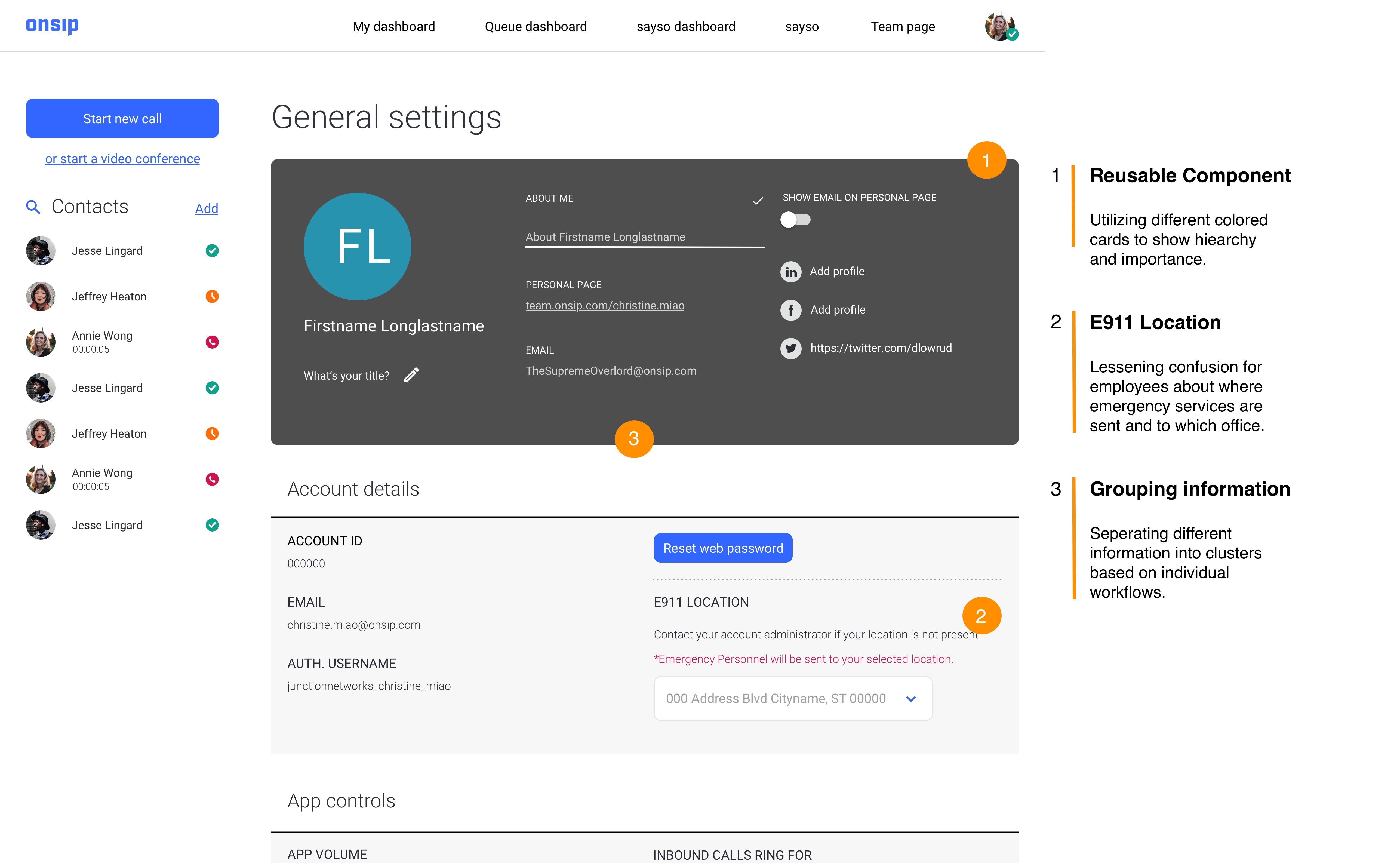
Old User Settings Page
The user settings page serves as a profile edit page where people can change configure their account and change personal info.
The support team was the primary stakeholder on this project was that they would frequently troubleshoot people signing up for our service and configuring the service which people in the old designs had problems with.
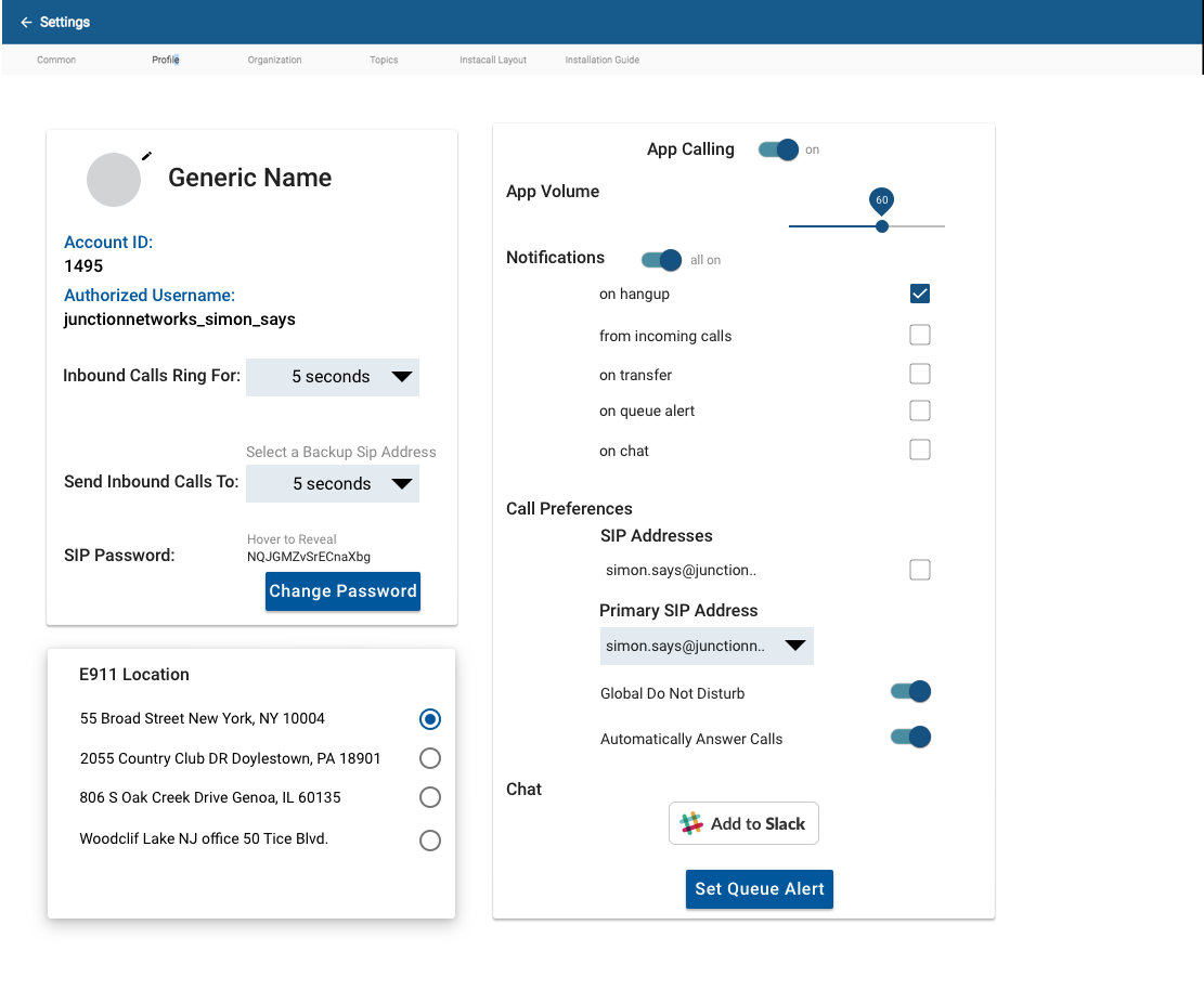
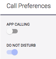
New User Settings page
The "profile edit" section would be a section that people could edit their "forward-facing" information. When a person edited their job title for example in this section-- the "team page" that site visitors would visit to view this person's profile page would reflect that job title change. The second and third section would be a section that one could edit their settings that reflect "internally".
- Account Details
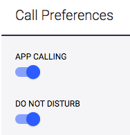
- App Controls
- Call Preferences
After the senior deisgner and I spoke at length with the support team and the CEO in multiple meetings led by the director of product, we learned what labels to best relegate to each section. This is reflected in the design below.
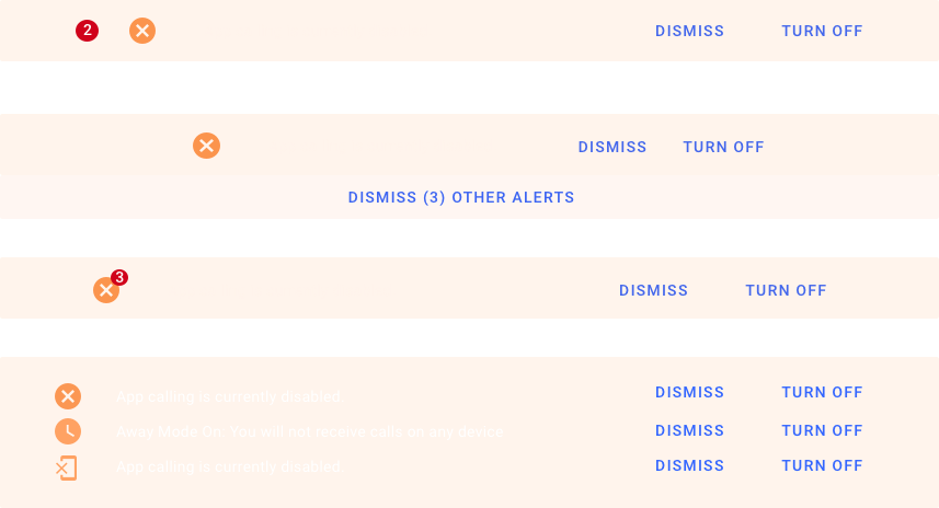
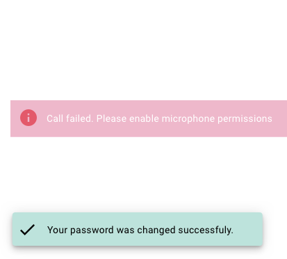
A Need for a Unified System of Notifications
While, the visual language was becoming more defined after the redesign, it was important to understand the different kinds of essential notifications that were needed in a calling app.
- People were setting themselves away and not receiving phone calls so needed a clear indication that they were away
- People were confused as to what Do not Disturb vs. Away vs. App Calling Disabled was
The Solution: Introduce disable states for toggles as app calling turning off meant do not disturb was turned off as well and signifying that through a banner.
Introducing Banners and Snackbars to the Pages
After speaking with frustrated customers and our sales and support teams I was able to figure out the key use cases where banners would need to be displayed, prominenetly in the app. These notifications or banners would need direct interaction to be hidden.
Banner Iterations
When I had multiple meetings with the stakeholders (engineering, support and sales) I was able to get a better sense of what I needed to consider when designing for the notifications.
- Different States (Icon vs. No Icon)
- Multiple Notifications: How would they stack? Would they stack?
- Notifcation with Call-to-Action Buttons and Copy (changed after customer response on release to production)
Challenging Questions:
- Would these be universal in the web application?
- Could it be used for other scenarios (Was reused when upselling customers later on etc.)
The Final Version
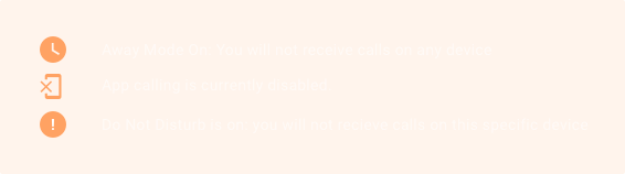
Introducing the Final Product
A glimpse of where and how it exists currently in the web application. Based on split tests with Likert scales, stacking was less usable and preferable to having other notifications hidden.
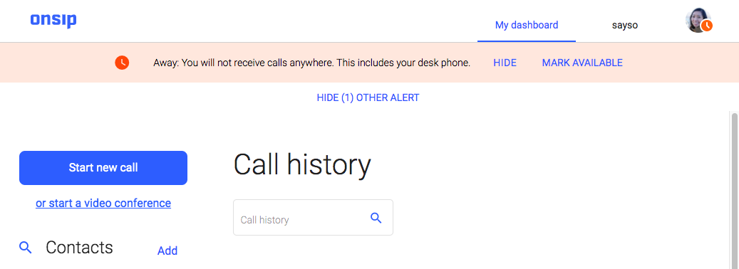
Succes and Error Snackbars
Simple, to the point and stays for 2.5 seconds based on user tests.
Reserved for in-between states when the nofication is important but not important enough for a persistent banner.
Trade-offs with Engineering
One of the most difficult things was discussing what things could be built custom and what engineering needed to be Angular material so that they would have to do less "hacks" and refactoring. There was significant pushback which I had to handle diplomatically and argue for design from a deep place of care for the customers.
There was also the visual difficulty of making a product look like OnSIP's own brand and not a Google product which required a delicate but deliberate balance.
Auditing the Work
All the pages had been redesigned and I had created a system of modals and notifications but there was a lot of inconsistency.
I printed all the pages of the web application and started posting stickies on what components we could unify across the web application with the product owner and senior designer.
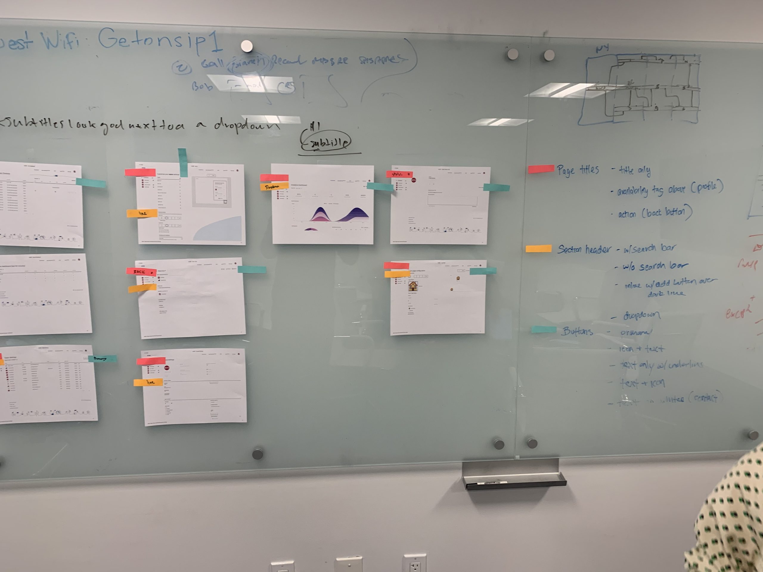
Creating Consistent Components
After spending weeks going nowhere, I decided to start on an atomic then component level of ideation.
I worked with the front-end engineering lead and his team to implement an "action bar" on the top of every single page of the web application that would contain key elements used to control a page.
The Action Bar
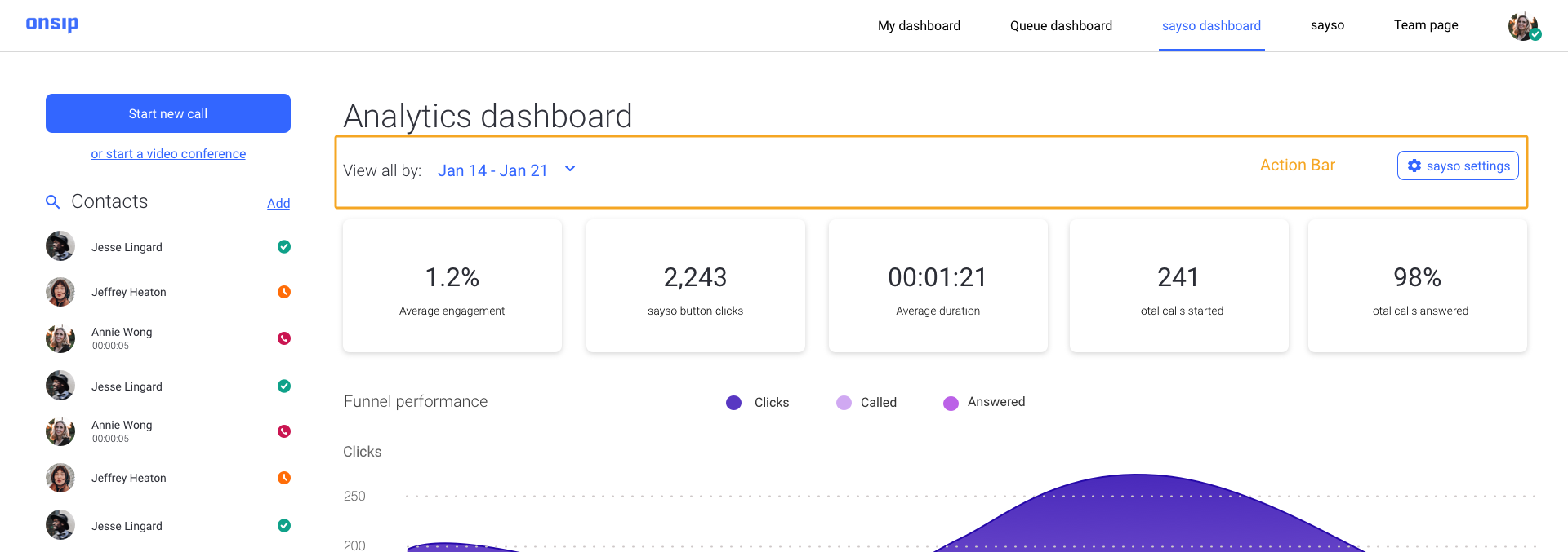
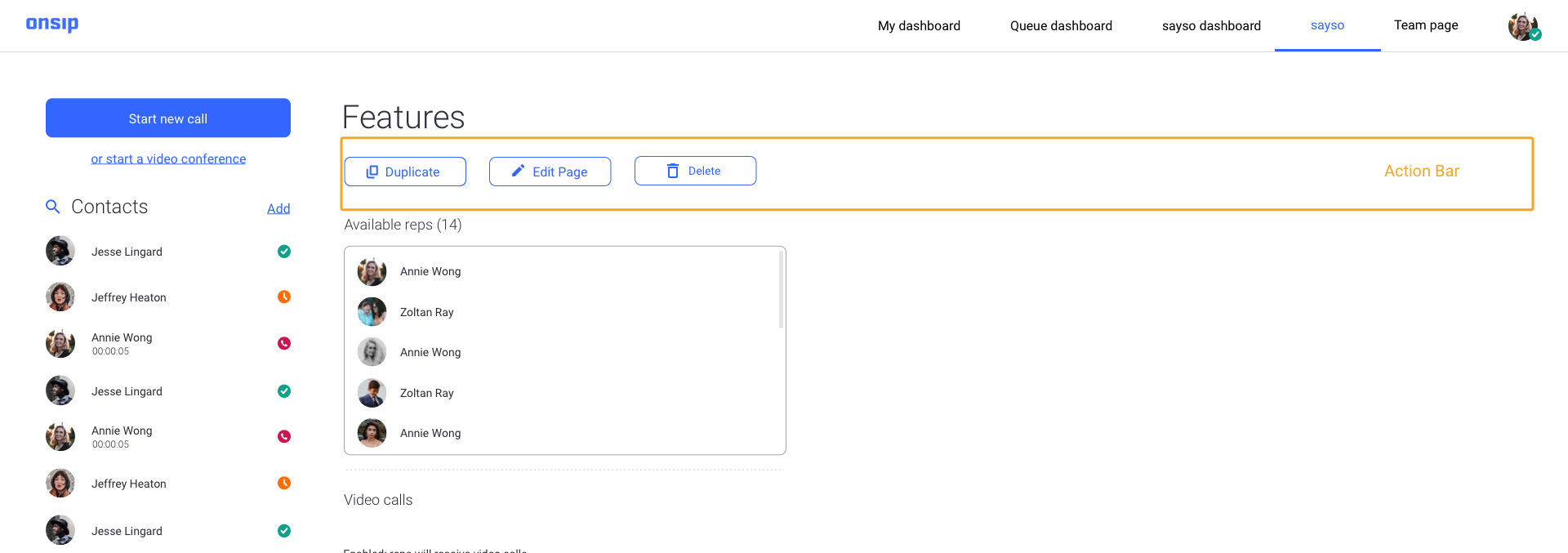
Action Bar Guidelines
Based on these wireframes, I started sketching out rules for the action bars and worked with the front-end lead to implement them The action bar would contain these elements:
- Secondary Buttons: that would be used to save an action or see a preview of changes made to a page. I made the decision here to use secondary buttons as primary buttons as I had been mostly using on popup modals to save or perform a critical action.
- Search Bar, Filters and Dropdowns
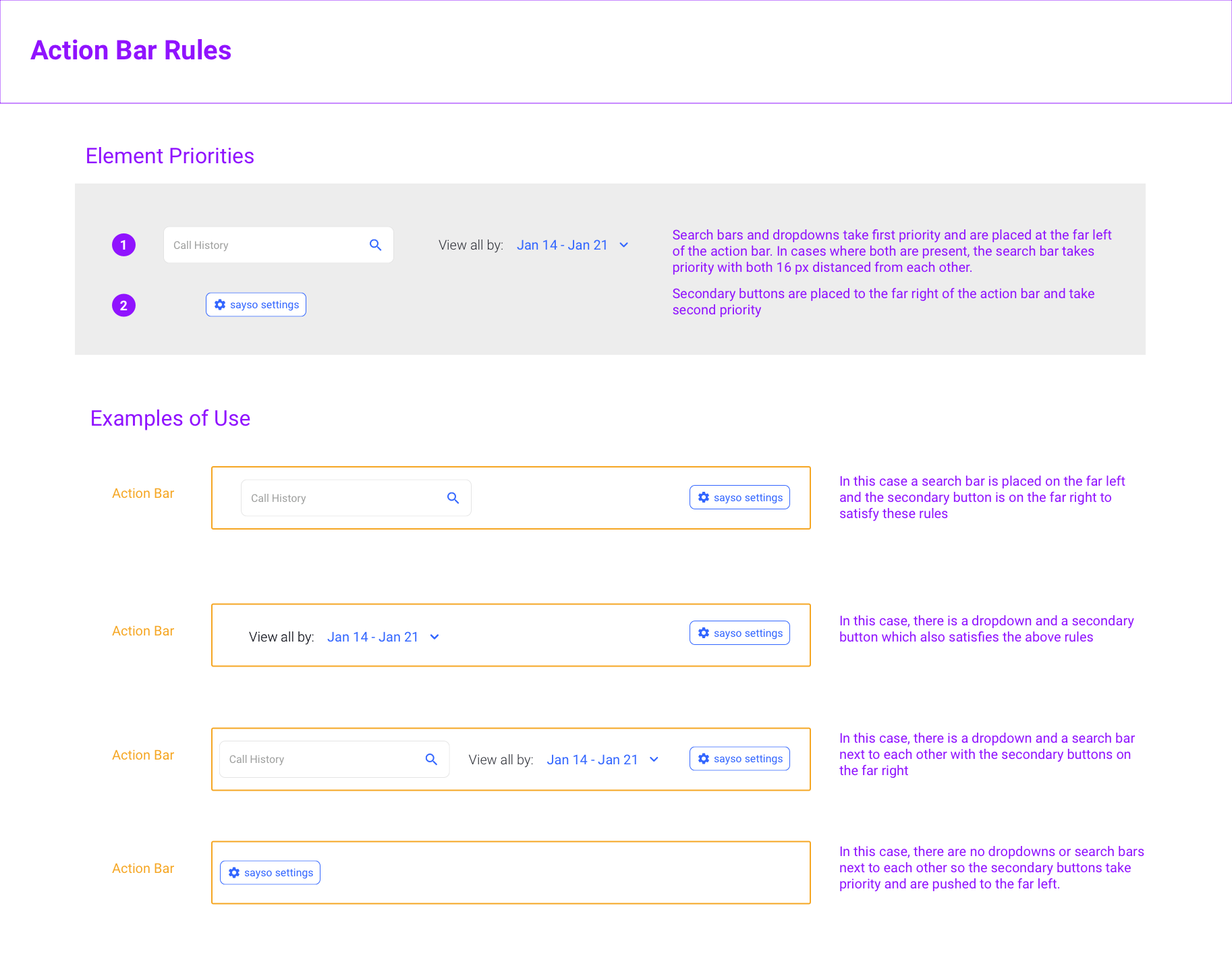
Difficulties in the Implementation:
As engineering was leveraging Angular Material as a framework there were constraints on having the buttons aligned inside the action bar due to built in padding and a bigger discussion was had with engineering leadership and the product owner based on whether we could find some way within the Angular material framework we were using to standardize the button heights and navigation elements so that they are all the same height.
Templating The Pages
In order to create a central document of truth, I made an Abstract account for a new designer that joined in March of 2020 and started creating templates for all of the pages of the web application in a master Sketch file so that anyone joining could have consistent files to work with.
When I was working solo on site as a designer, I had no reason to share design files with anybody other than myself and a single other remote senior designer. As a result, my Sketch files were a mess and it was necessary to organize them all in a single file across all break points at this point. The senior designer gathered all the existing buttons, toggles and interface elements into a single document which I referenced as I created the templates.
After this was done we created a spread sheet and listed all the user interface elements that needed to be made consistent. This whole process took two months to undertake.
Auditing More Inconsistencies
After the template effort, I was able to create a UI document that we were incrementally making into tickets for front end engineering to implement. We prioritized smaller changes first to test the waters before moving on to bigger action tickets.
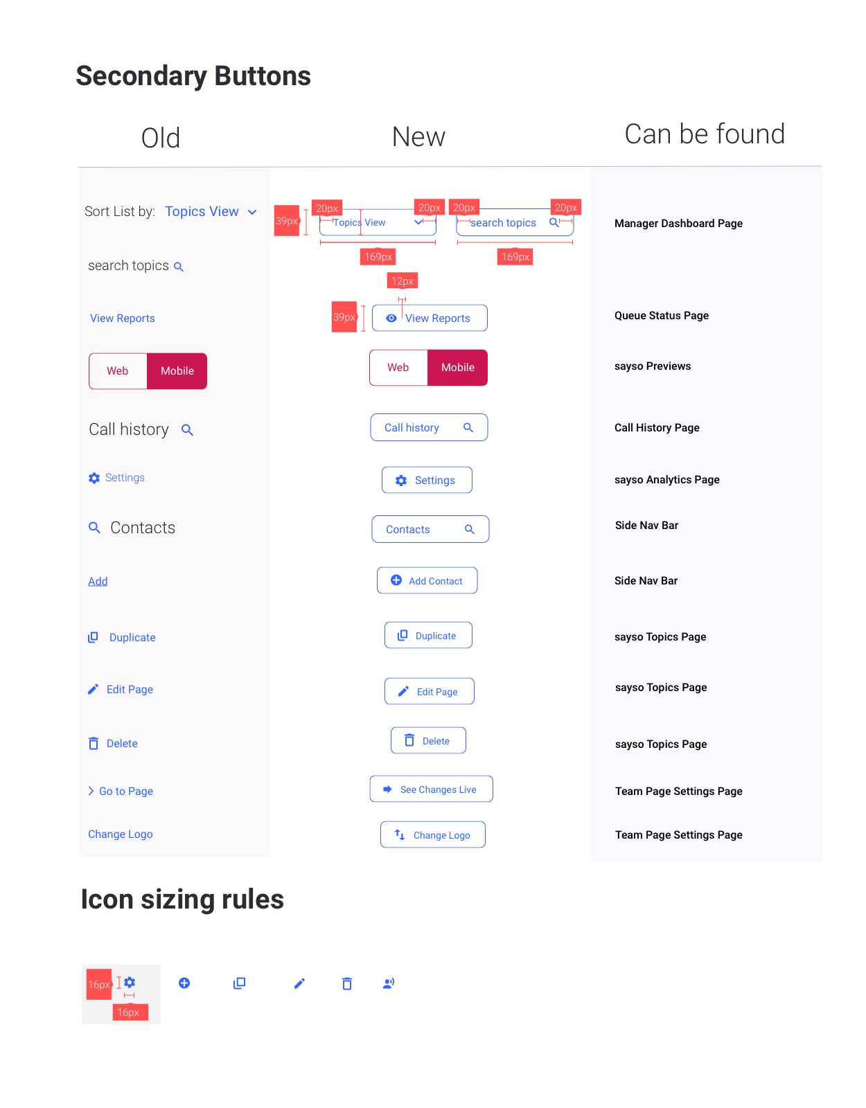
I had to track down where each of the inconsistencies in the user interface were in order to unify all the button styles. I created a document to show engineering on how the new buttons would change from the old, redlined the px values and noted where the button styles could be found throughout the web app.
Document I put together for engineering on button height and width rules.
Impact
The design system for OnSIP was still in the works as I left. We started conversations around including ARIA for accesibility on the engineering side while constantly checking contrast ratios to ensure at the minimum AA compliance.
The design system helped the engineering side build handed off designs quicker as they knew what the components, proper button usage and font sizes would be by just glancing at the designs. Customers remarked that the app was much easier to use and helped us retain customers at that critical moment when they first started making test phone calls during their free trial period and all the way to paid.