It was fun, it was educational and it was life
changing
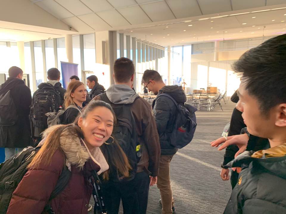
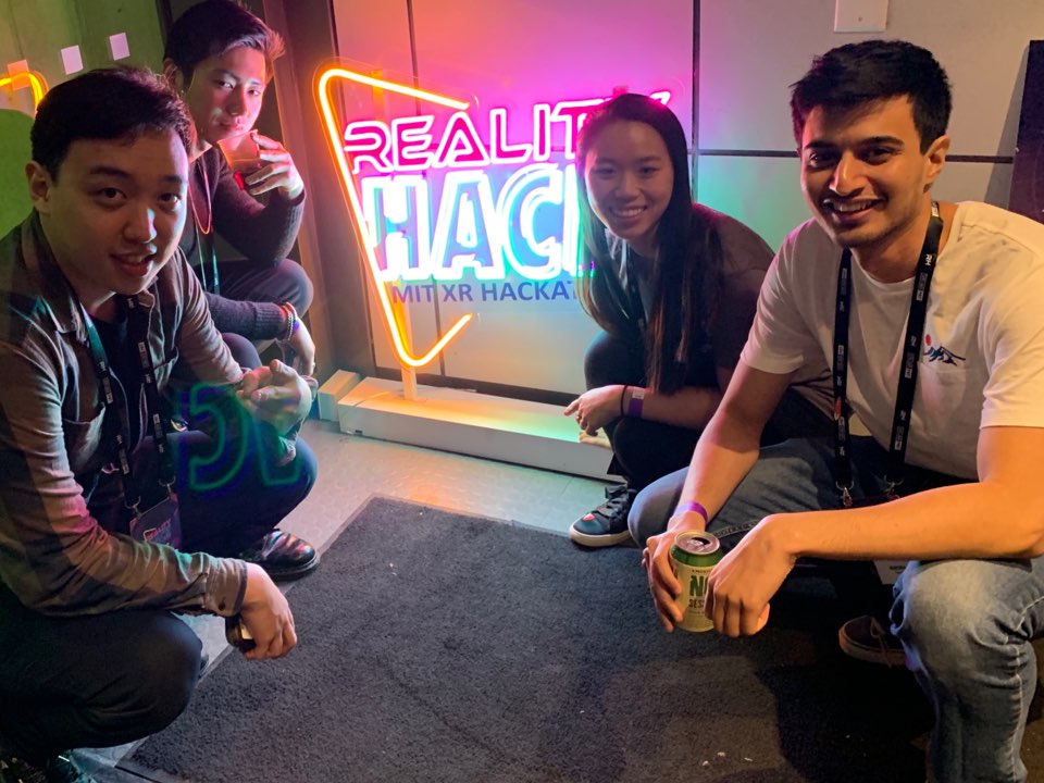
I applied and was accepted to participate in MIT's 2020 Mixed Reality Hackathon. It was the fourth time it was run and the hackathon ran for five days. It was one of the most influential and fun times I have had in tech and was a welcome break from working in the industry. It gave me fresh perspectives on how I approach tech, understand it, how to work with people from varied backgrounds and countries and push the boundaries of technology in very short stressful, time spans.
The first day of the hackathon was a series of college lecture style workshops based on a schedule. We could pick to attend talks on creating 3d models with Blender, lectures on the Unity game engine, how to best utilize sound in virtual reality applications and how to create effective storytelling experiences in mixed reality. It was interesting to see how the same general principles of UX and accessibility applied in a new technological environment like virtual and augmented reality. (Subtitles for VR experiences, expected behavior of objects in a simulated environment, sounds etc.)
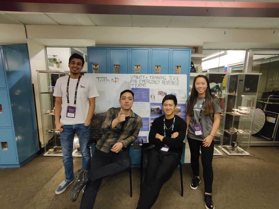
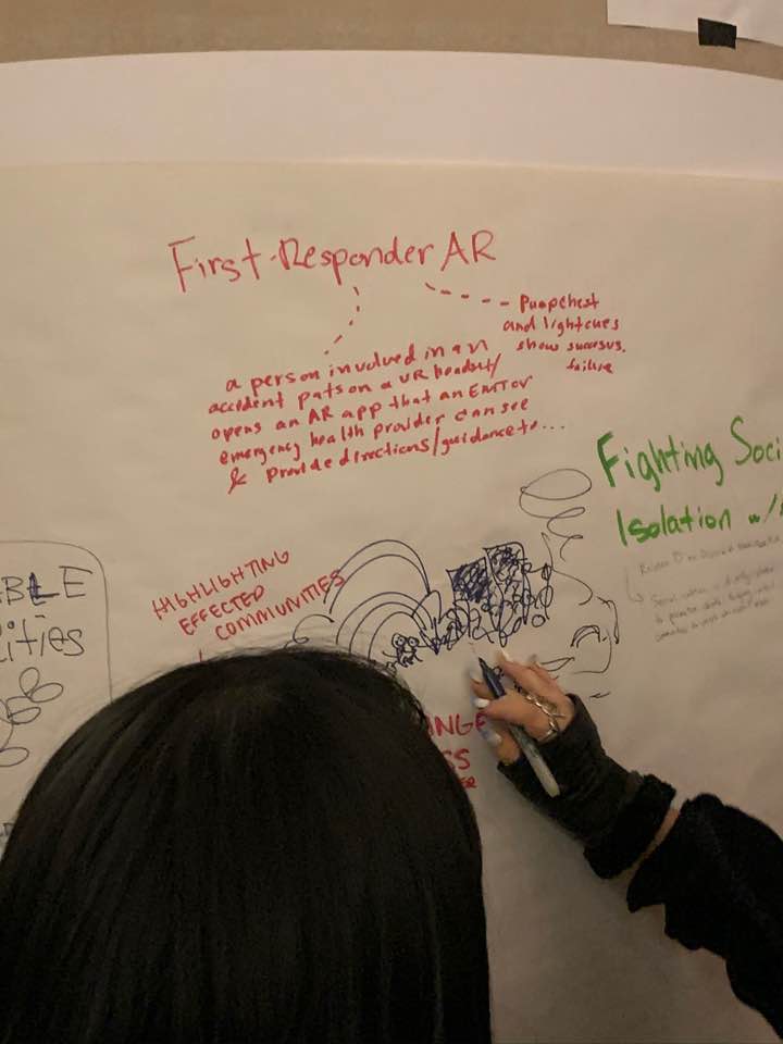
I pitched an idea that fell under the category of social good and managed to gather a team of five people including myself.
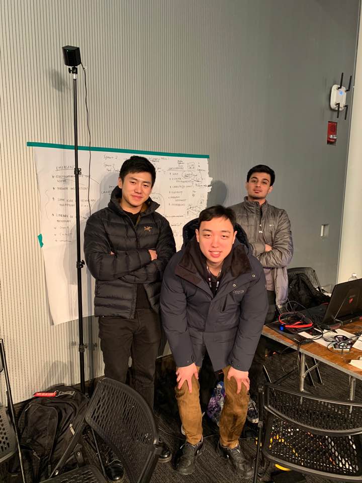
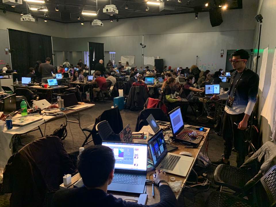
We spent the next three days hacking, bonding and creating technology experiences that did not exist just the three days before.

The Idea:
Our team (Firetruck) went on to place in the top five for AR applications out of forty different teams with out idea for an augmented reality based utility application that would help volunteers in post-disaster situations.
Ideation Stage:
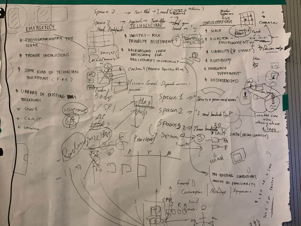
The original idea was answering a “what if” scenario. What if you're a bystander or party of a party where someone has found themselves in a car accident. If, in this hypothetical scenario, you could put on a pair of augmented reality glasses and then communicate with first responders and emergency personnel that are on the way to the scene? You could take instructions from the EMT's and pump the heart, perform basic first-aid etc.
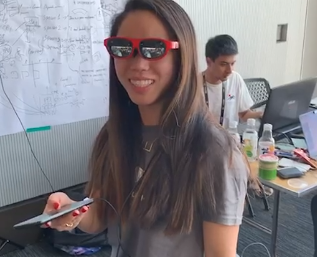
To validate this idea, me and a teammate – Puja Nair conducted user research on the first day of the hackathon by traveling to the Boston EMT training school on a blisteringly cold January day. After speaking with the EMT's we learned that we had to pivot on our idea to technical limitations in our idea. It was literallly the coldest day of my life and almost died of frostbite.
Our new and final idea was inspired by the parents of one of our team members who is part of CERT (Community Emergency Response Team). CERT members spend time volunteering and training to help out with tasks such as search and rescue, first-aid, food and water distribution etc. after major disasters such as Hurricane Sandy and earthquakes.
Current Pain-points in the field:
- CERT members go into buildings – essentially blind. One person stays outside and the other person is connected by a piece of string. There is no clear idea of what is going on inside
- Actual physical paperwork that has to be filled out and viewed physically instead of digitally
- Having to navigate to a body and flag it with a physical “piece of tape”
- Overall ineffective resource allocation from central command (Unable to quickly see where to send volunteers to administer first-aid, hand-out supplies and water.
- We realized how much of a benefit augmented reality glasses could be in these scenarios as a post-disaster relief volunteer could:
Instead, what if people could:
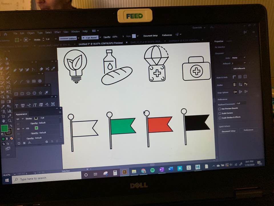
- Put on light-weight, portable, augmented reality glasses that are connected to a mobile app.
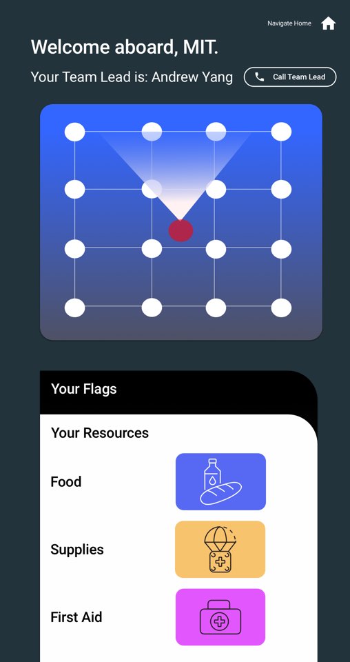
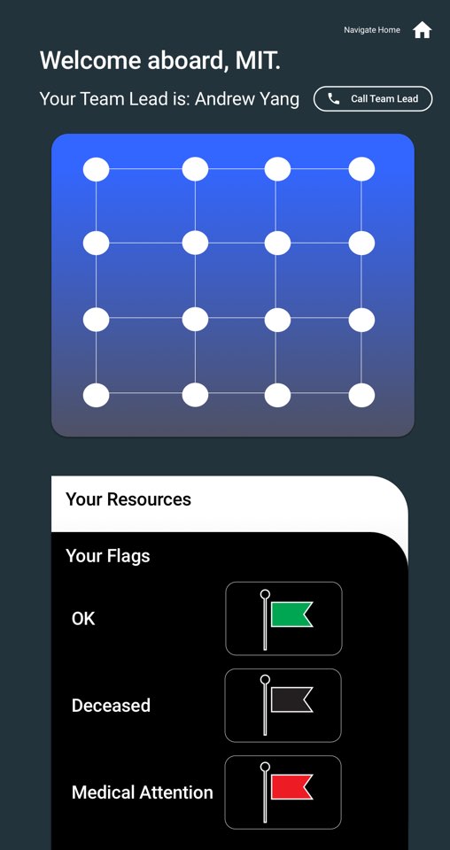
- See immediately in the glasses where help is needed through floating colored orbs, the distance to the location, photos and quick information on the location
- Navigate to the location, GPS mark the location as having administered first-aid, distributed water and supplies, needing further medical attention, or deceased.
- Have a real-time chat feed of other events occurring in the top right-hand corner of the viewport.
- Microphone and live video feed communication with central command through the glasses
- A mobile app for reference and accessory as primary alerts and chats are broadcasted on the AR glasses
Design and Engineering Phase:
The original idea was to have GPS tags so that we could have a realistic guidance system in the AR glasses as is done on GPS powered driving apps like Google Navigation or Waze. So in our demo we would have someone navigate to a “body”, drop water, resources or flag the location as needing further medical help or as deceased.
Engineering Limitations:
GPS was unfortunately accurate only accurate to a 3m radius. This required us to build the app with multiuser capability in which all the users are on a single session. There were also hardware limitations with the glasses we used -Nreal. As it is a new piece of hardware, there were only three pages of developer documentation. These roadblocks were rapidly overcome by cutting out features that we had originally proposed.
Design Limitations:
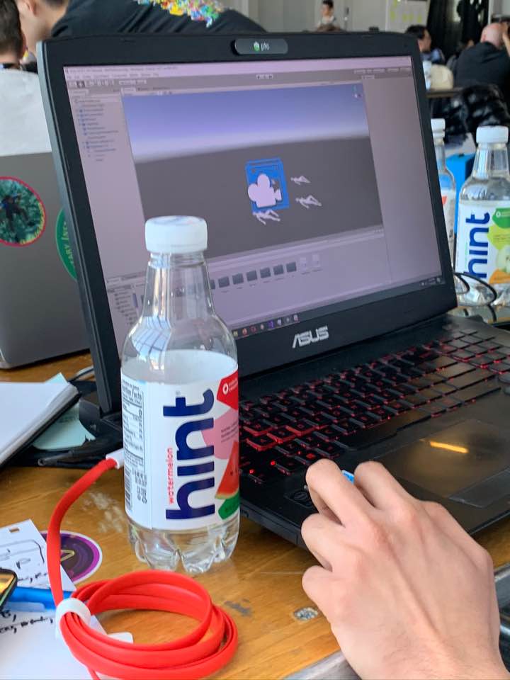
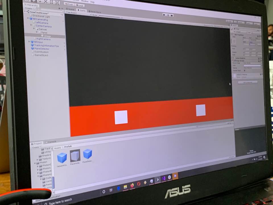
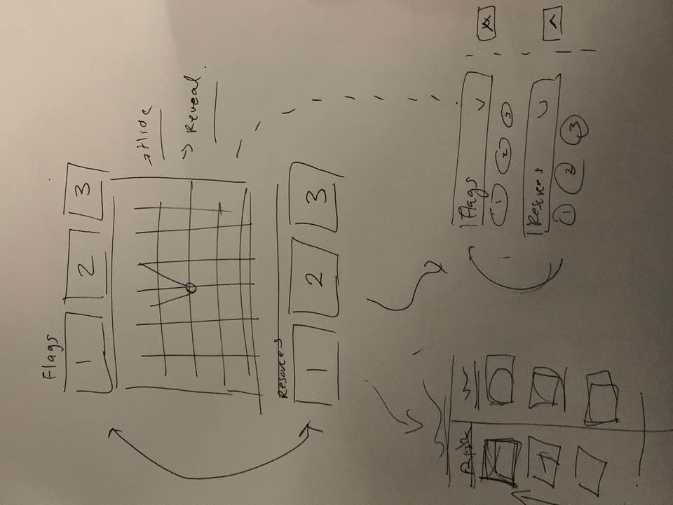
The Nreal viewport was only 55 degrees which limited the use of AR space for interaction, icons, chat feeds, and other UI elements. I decided to design as transparent of a bar as possible that would go on the bottom of the viewport as to not block the eyes from viewing objects in reality. (Icons and UI elements were impairing the field of vision)
The viewport in unity. The horizontal red bar on the bottom was the limited space I could use to place icons that would be seen through the AR glasses.
Our Solution:
We had to ultimately create a demo and user flow that made the most intuitive sense for the user. While I was designing what was seen by people on the mobile app, the engineer and other members of the team were working on a separate “flagging system” that I had no idea was in creation.
I had thought were were only creating three buttons the mobile app itself. In my understanding of the demo scenario:
- People would navigate to a body, press one of three buttons (administer first-aid, give water or supplies)
- Then move on to another body in the viewport
However, my teammates were envisioning an entirely different scenario:
- People would navigate to a body, press one of six buttons (administer first-aid, give water or supplies, flag as deceased, flag as further needing medical attention, flag as OK)
The design and flow problem came from these gaps in understanding.
I had to rework the entire UI so that in an Apple-pay kind of interaction, users could toggle on a single page between three different kinds of buttons.
Wireframes we did as a team of different scenarios
I also reworked the entire demo scenario so that in the final demo people would:
- See random bodies in the distance as soon as they put on the glasses
- Navigate to the body
- Flag as deceased, further medical attention, or OK
- Optionally also give water, food or first-aid
- Navigate to another body as the body disappears
See what we did at this link!: https://devpost.com/software/tethar
Takeaways:
- The difficulty was in matching up the colors that display on the floating, diamond-like orbs and having them match up with their graphical representations on the UI.
- Pivoting is hard during a hackathon so do it early
- MIT KNOWS HOW TO PARTY.