Counter Racism with Creative Community-Building
For more information on the project:
Masksforunity.com/about-us
https://sva.edu/features/bfa-design-faculty-member-s-masks-for-unity-project-counters-racism-with-creative-community-building
Our Solution:
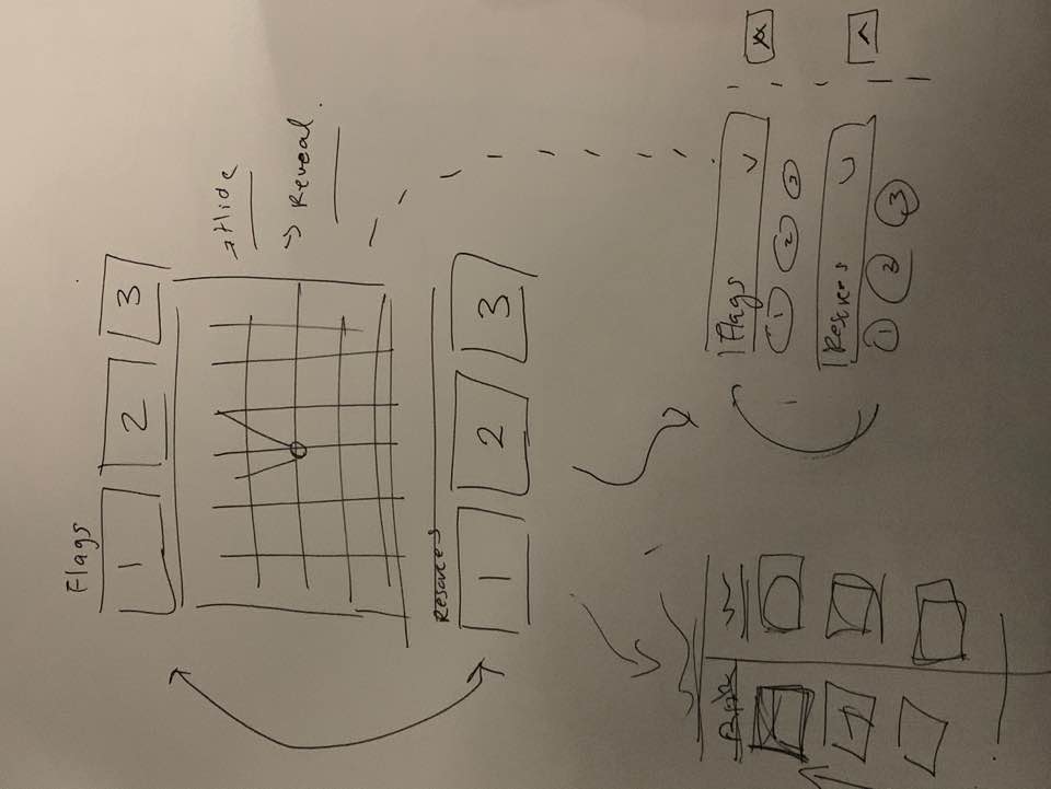
We had to ultimately create a demo and user flow that made the most intuitive sense for the user. While I was designing what was seen by people on the mobile app, the engineer and other members of the team were working on a separate “flagging system” that I had no idea was in creation.
I had thought were were only creating three buttons the mobile app itself. In my understanding of the demo scenario:
- People would navigate to a body, press one of three buttons (administer first-aid, give water or supplies)
- Then move on to another body in the viewport
However, my teammates were envisioning an entirely different scenario:
- People would navigate to a body, press one of six buttons (administer first-aid, give water or supplies, flag as deceased, flag as further needing medical attention, flag as OK)
The design and flow problem came from these gaps in understanding.
I had to rework the entire UI so that in an Apple-pay kind of interaction, users could toggle on a single page between three different kinds of buttons.
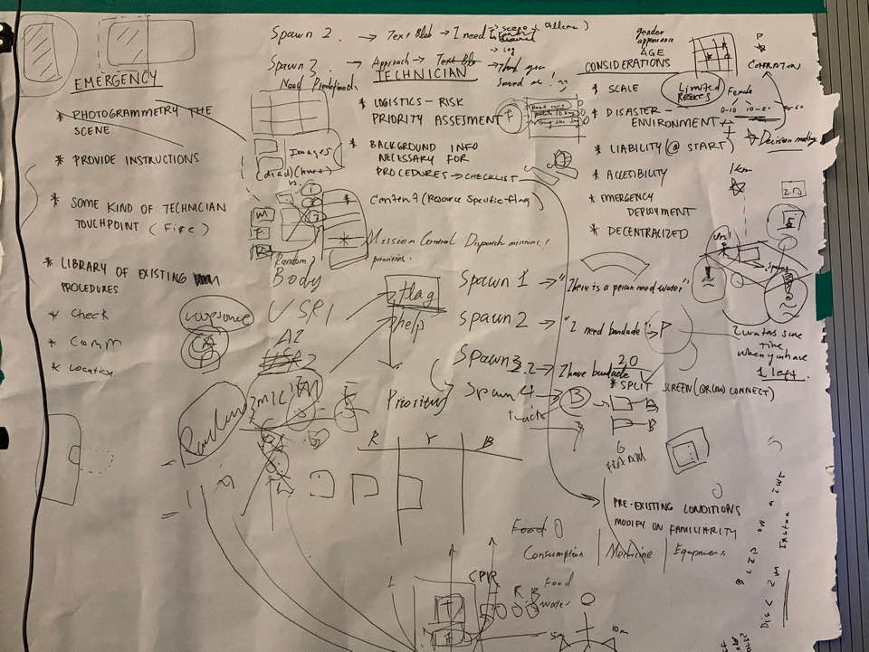
Wireframes we did as a team of different scenarios